Crafting a Design System for ADPList to unify interface elements, ensuring clarity, community engagement, and a streamlined user experience
PRODUCT TYPE UX Design System
CLIENT(CLASS PROJECT) ADPList’s Design System
TIMELINE February-May 2024
TEAM Priyanka Jain (me)
Freya Pan Esther Kim
Nehal Sharma
MY ROLE Creating ADPList’s Inventory, UI kit (creating components, articulating design values, branding), writing documentation, pitching the design system
TOOLS USED Figma, Docs, Zeroheight
We embarked on creating the ADPList design system to streamline our platform's interface and enhance user experience. Leveraging tools like Figma and Zeroheight, we meticulously crafted a comprehensive UI kit and documentation, ensuring clarity and accessibility. Through collaborative testing and engaging pitches, we showcased the system's value, aiming to streamline design processes and foster community engagement. The journey encompassed key challenges, strategies, and outcomes, offering insights into the process of designing a robust and user-friendly system.
Overview
ADPList is a global mentorship platform connecting designers with experienced professionals across various design disciplines. It serves as a hub where aspiring and established designers can seek guidance, advice, and mentorship to advance their careers and skills in the design industry.
Our team's three main goals were to keep ADPList simple, build a supportive community users, and prioritize user-centric design principles
Transforming Chaos into Consistency
Does ADPList truly need a Design System?
ADPList is a vital platform for designers seeking mentorship and career growth. However, without a proper design system, it faces challenges. Disorganized assets may lead to inefficiencies and delays in finding essential files, while inconsistencies in design elements may diminish user experience and platform credibility. Moreover, unclear design instructions may lead to communication breakdowns between designers and developers, hampering collaboration.
Enter SIDEKICK- by centralizing assets, establishing clear design guidelines, and enhancing communication, Sidekick can elevate the user experience, increase productivity, and better serve its community.
The Process
How did we go about creating the ADPList Design System?
1
Deconstructed and analyzed ADPList's website for design elements.
Compiled a comprehensive inventory of elements that make the interface.
UI Inventory
2
UI Kit
Defined the brand and design principles
Developed reusable components and styles in Figma.
Tested with users for validation after publishing.
3
Documentation
Created a comprehensive documentation site outlining design guideline, styles, components and resources.
Deconstructing ADPList interface to identify patterns & inconsistencies
UI Content Inventory
We started exploring ADPList's design by taking screenshots of different parts of the website. Following Brad Frost's method, we categorized them into atoms (like buttons, text styles, colors and icons) and molecules (like search bars and navigation menus). Then, we looked at larger structures, or organisms, such as headers, footers and cards, to ensure consistency. We also reviewed layout templates across pages to maintain user-friendliness. These snapshots helped us understand how everything worked together and spot any differences or patterns, giving us a good starting point for our design analysis
The Problem
UI inconsistencies demanding a robust Design System
Upon reviewing the UI, we noticed inconsistencies that signaled a need for a design system! Such a system would streamline and standardize elements, organizing them and ensuring a more cohesive and user-friendly experience. We identified issues like unclear primary colors, inconsistent spacing, varied button styles, typography differences, different icon type usage, and more.
For example, the buttons exhibited several issues contributing to confusion: one button with multiple states, two different filter buttons, numerous button colors and types, multiple link colors and style and various ‘close button’ icons.
Rectifying these types of inconsistencies with a unified design system would enhance the usability of ADPList platform and create a seamless experience for users.
Design challenges arising from ADPList's interface updates
Dynamic Challenges
After conducting the UI inventory, we dove into creating a design system for ADPList. One challenge we encountered was the continuous updates to the website, as it was still in the beta phase. So, we stuck with the screenshots we had from our initial inventory. Despite the website evolving with new elements, we humorously recognized that our design system could potentially assist ADPList during this time of updates development.
Our Guiding Principles
Unlocking a fusion of ADPList's mission and our team's values
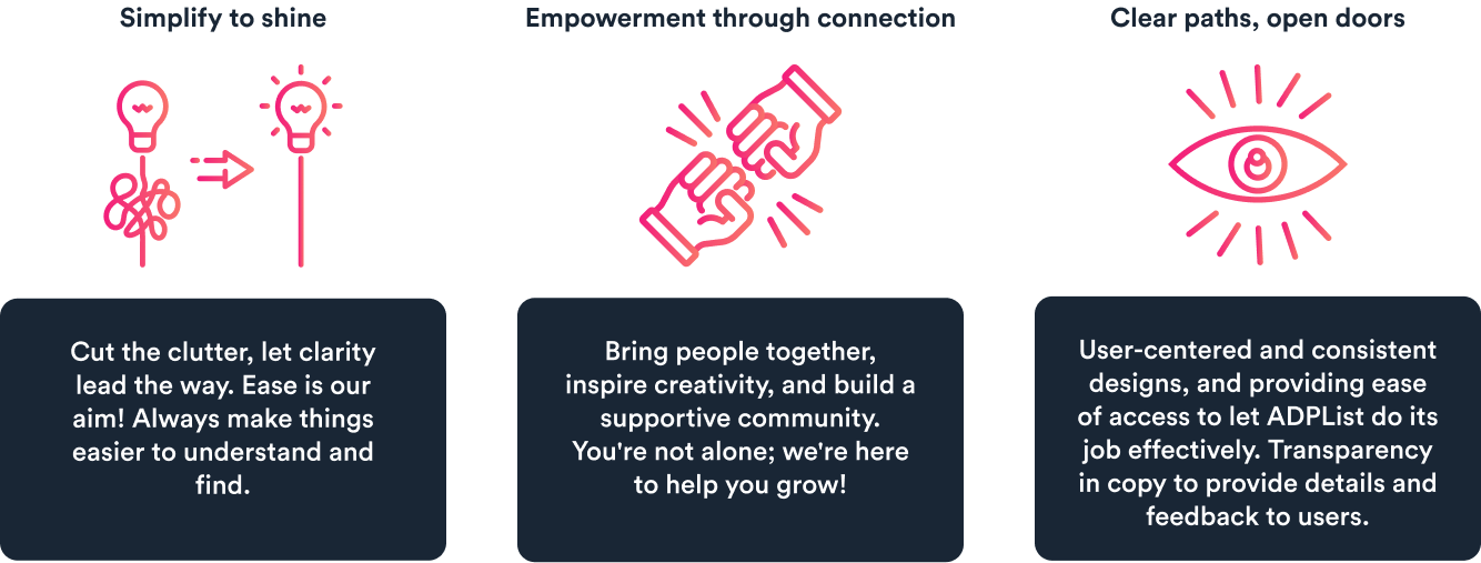
Our guiding principles were like our North Star in design—they kept us grounded and true to our values. They were simple yet powerful reminders of what mattered most in our work:
User-centered design
Clarity
Community
Socializing the system
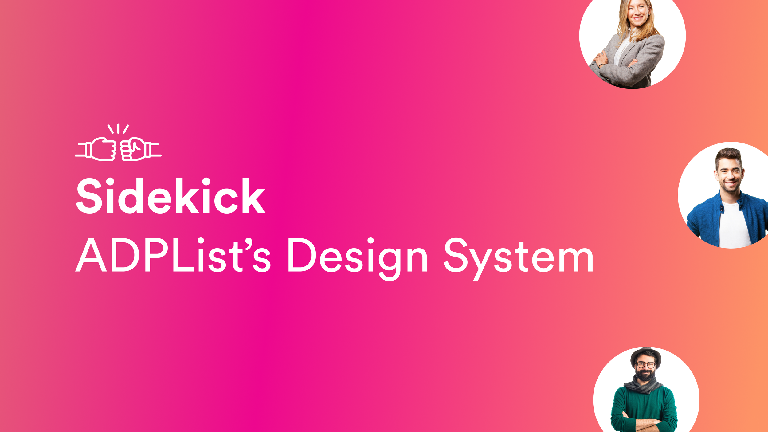
Bringing ADPList's brand values to life: Meet Sidekick!
After establishing our principles, we focused on branding the design system to align with ADPList's values.
We chose the name "Sidekick" because it embodies the idea of being a loyal companion, providing support and resources for designers and developers. This name also reflects our commitment to assisting users in their work effectively.
We also crafted a logo featuring a "fist bump," symbolizing teamwork and support, and reinforcing Sidekick's role as a trusted ally for designers and developers
Constructing UI Kit
Using Atomic design to create scalable, consistent & concrete elements
In this phase, we implemented Brad Frost's atomic design methodology for creating Sidekick, creating scalable and consistent elements. This involved breaking down the interface into small, reusable components called atoms, which were then combined to form larger components and pages.
Atoms(Foundational elements)
1
In the Foundation phase of crafting our Sidekick design system, we focused on setting up a common language for our design team. We started by defining the basics: grids, spacing, fonts, colors, and icons. This gave us a solid starting point to build upon.
Establishing a unified design language & prioritizing accessibility
We used colors(includes: saturated, neutral, alpha and gradient.), fonts(Sharp Grotesk PE & Circular Std) and icons as per the standard brand guidelines to create a unified look and feel. Plus, we paid attention to spacing and layout to keep things balanced and organized. Throughout this phase, accessibility remained a priority, with careful consideration given to color contrast and adherence to WCAG guidelines.
Overall, this phase was all about laying the groundwork for a design system that looked great, worked well, and was accessible to everyone.
2
Molecules
Developing complex components from the foundational atoms
Our molecules, built upon foundational atoms, formed the backbone of the Sidekick design system. These components, included buttons, form elements, and interactive elements like search bars, tabs, and dropdowns, were crafted to fulfill specific interface functions. Through a systematic approach guided by our foundational elements we ensured consistency and cohesion across all elements.
For example - Buttons
The Sidekick Design System presents an array of button types, each designed for specific contexts. Available in four sizes and different states – Extra Large (XL), Large (L), Medium (M), and Small (SM) – these buttons offer adaptability to various screen sizes and user interactions.
Moving from molecules, we shaped organisms like cards, indicators, images, navigation elements, which compose intricate sections of the interface. These organisms, made up of interconnected molecules, offer a tangible glimpse of the final interface. By leveraging our foundational molecules, we pieced together organisms, simplifying the design process while maintaining a cohesive visual style.
Interconnected molecules starting to form more concrete components
Organisms
3
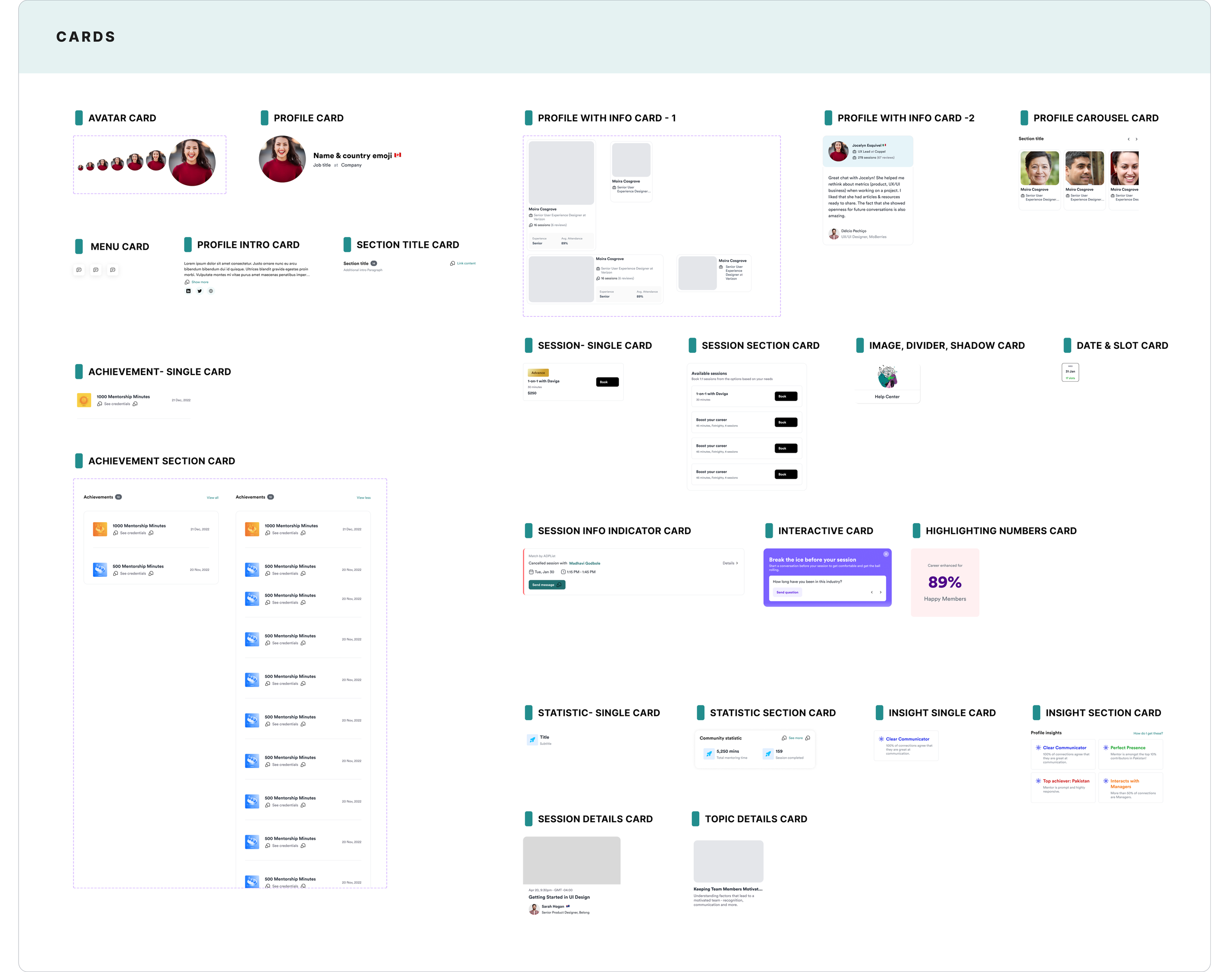
For example - Cards
We created versatile card components(variants). With customization options such as icons, colors, layout, and text properties, our cards are adaptable to different design needs, ensuring consistency across interfaces. They play a pivotal role in creating dynamic components that adjust to various states, contributing to a seamless user experience.
Testing the UI Kit with other designers to help improve the usability
Usability Test
Upon the completion of our UI kit for ADPList, we published it to the Figma community for testing by our fellow designers, including our classmates. As they utilized the kit to construct a page resembling ADP's website, we closely observed their interactions, identifying areas of ease and difficulty.
Findings- We found that the testers struggled to understand component names from the assets panel, leading us to refine and provide more specific names. Furthermore, they praised the kit's flexibility in customization, thanks to features like variants and nested properties, and expressed satisfaction with its overall organization.
Feedback received on the UI Kit
This was so quick! Thanks to these components. It took me hardly any time to design the page”
“
After completing the UI Kit, we crafted a comprehensive documentation for the ADPList design system. This documentation aimed to facilitate onboarding for new and existing designers and developers, providing guidance and direction for all, and fostering socialization and governance of the system. Leveraging Zeroheight, we streamlined the documentation process, ensuring accessibility for users of varying backgrounds.
Helping users better understand the system and apply it to their design
Documentation
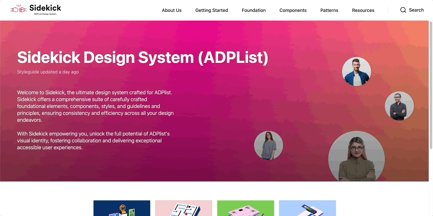
The Sidekick design system documentation aims to empower users with comprehensive resources and guidelines for creating cohesive and user-centric experiences. It provides detailed usage instructions for components, insights into design principles, and governance policies. The focus on accessibility and inclusivity ensures alignment with organizational objectives, while dos and don'ts guidelines promote consistency and best practices.
Pitch Presentation
After meticulously crafting our documentation, we unveiled Sidekick's potential through an engaging pitch.
Crafting an engaging Sidekick Pitch: Bringing ADPList's superhero to life
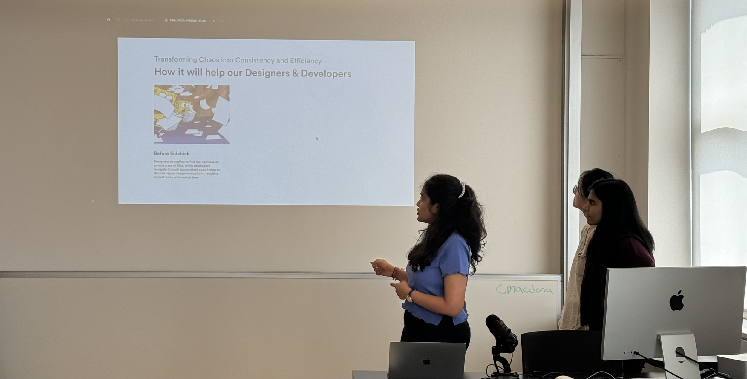
Opening speaker for the pitch, along with my team
With an enthusiastic fist bump, we introduced Sidekick, our design system's trusty companion. Curious about the name? We shared the story behind it, adding a sprinkle of personality to our pitch.
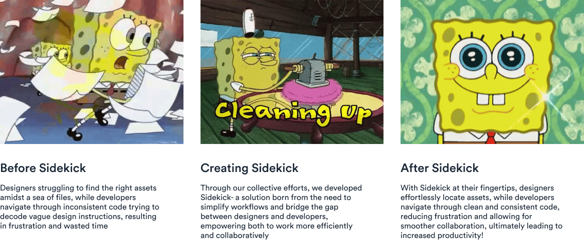
Transitioning smoothly, we painted a picture of life before Sidekick, highlighting the challenges our users faced. Then, with a flourish, we revealed how Sidekick swoops in to save the day, making designers' lives easier and more delightful.
How it will help our users
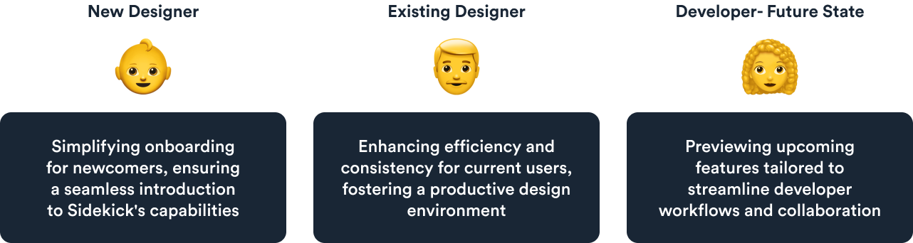
But wait, there's more! We didn't just stop there. We delved into the specifics, catering to the needs of every user group – from newcomers to seasoned pros. And of course, we couldn't resist adding some SpongeBob gifs and emojis for extra flair!
Catering to diverse user needs
By the end of the pitch, we had everyone nodding in agreement and smiling from ear to ear. The positive feedback was music to our ears, affirming Sidekick's role as the ultimate superhero for ADPList!
Takeaways and future goals
Recognizing documentation's significance and prioritizing developer collaboration for the future
Reflecting on our journey in crafting the design system, I've realized how crucial it is to have comprehensive documentation. It's like the guiding light that helps everyone understand and use the UI Kit effectively. It not only provides clear instructions but also tells the story behind our design choices. As we move forward, I'm excited to continue improving our documentation, making it even more user-friendly and insightful for everyone involved.
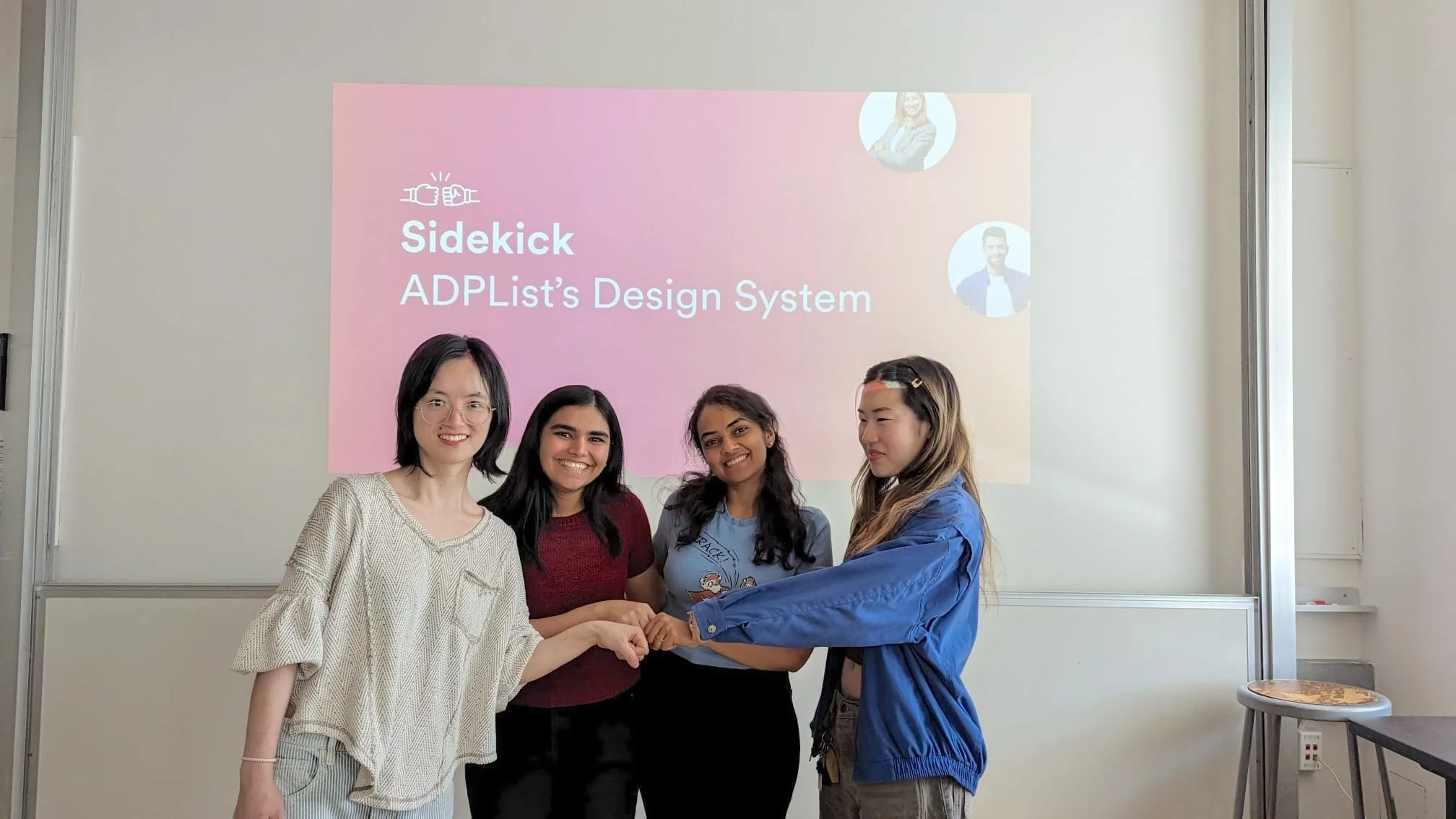
My team from left to right- Freya, Nehal, Priyanka, Esther
Lastly, If I were to redo the project, I'd prioritize accessibility, recognizing its fundamental importance in creating inclusive design systems. Additionally, I aim to streamline collaboration with developers by incorporating more developer-friendly elements, facilitating smoother integration of design elements into code.