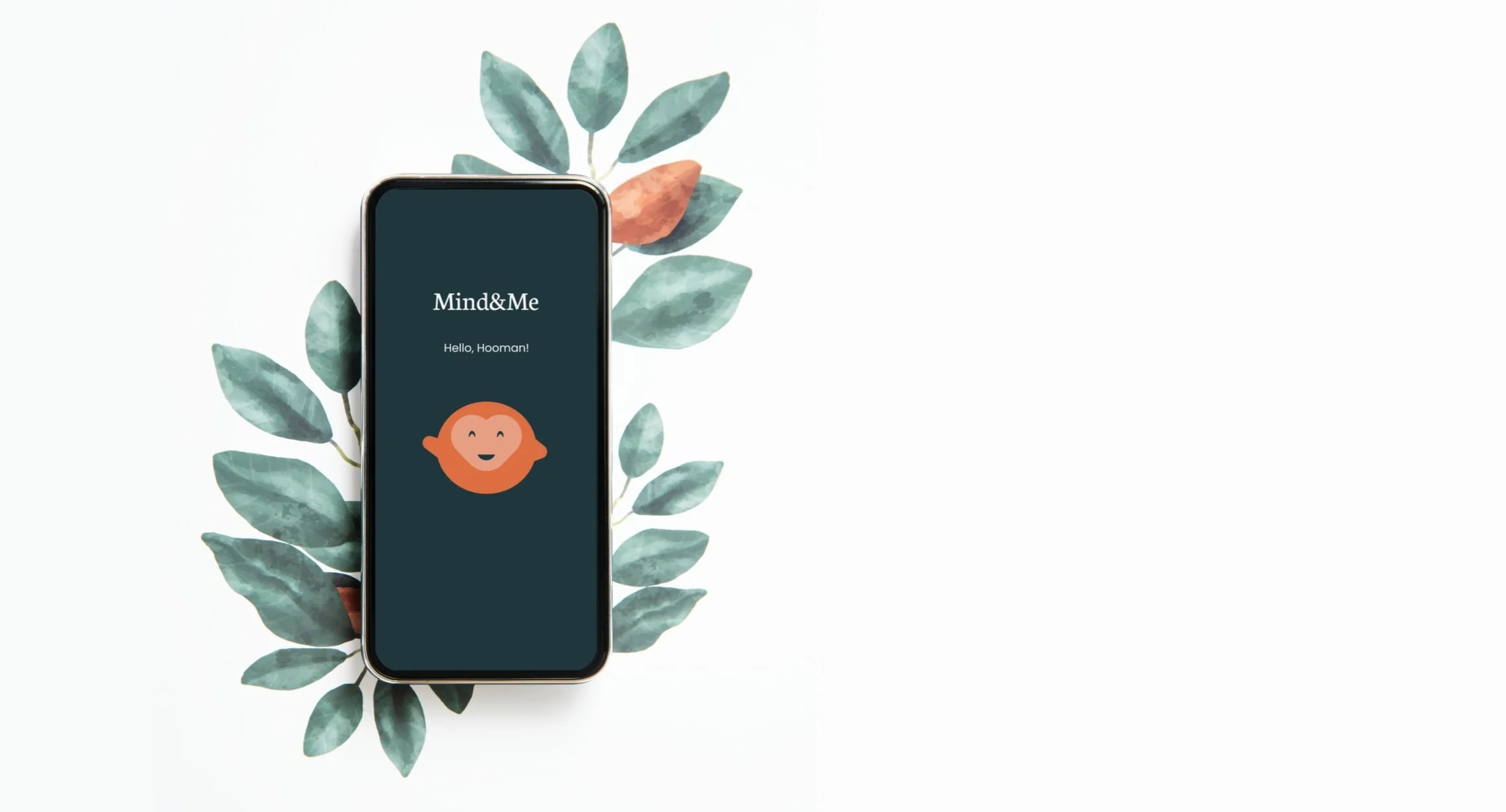
A wellness app
Mind&Me
Bridging the Mental Health Gaps by empowering Users with a Unified Wellness Platform
METHOD Research & Design
PRODUCT TYPE Mobile App
APP NAME Mind&Me
TIMELINE
August-December 2023
TEAM Yeatasmin Shiropa
Priyanka Jain (me) Karan Vora
Tharani Prabu
MY ROLE
UX Designer & Researcher
TOOLS USED Figma, Miro, FigJam, Zoom
Our project, Mind&Me, was a transformative mental health app engineered to alleviate the burdens of mental health challenges within a complex and bewildering landscape of resources. Through rigorous research and development, we crafted a holistic platform that served as a singular destination for comprehensive mental well-being management. Offering therapy, mood tracking, sleep tracking, relaxation techniques, and education all in one accessible space, Mind&Me was designed to empower users on their mental health journey and redefine the paradigm of mental health management.
Overview
In 2019, statistics revealed that 1 in every 8 people globally were living with a mental disorder, with over half of adults with a mental illness going untreated. To address these staggering figures and the challenges faced by individuals in accessing effective mental health solutions, we embarked on a journey to create Mind&Me, a revolutionary mental health app. With a mission to provide a holistic, user-centered solution, we aimed to bridge the gap in mental health support and empower users to manage their well-being more effectively.
The problem unveiled
Individuals facing mental health challenges struggle to access a streamlined and effective solution for managing their mental well-being, hindering their ability to attain a happier and balanced life
Enter- Mind&Me!
Our mission is to offer our target users with a healthcare app that aims to revolutionize mental health management by providing a holistic, user-centered solution.
Insight to Impact: The Design Process for Enhanced Mental Well-being
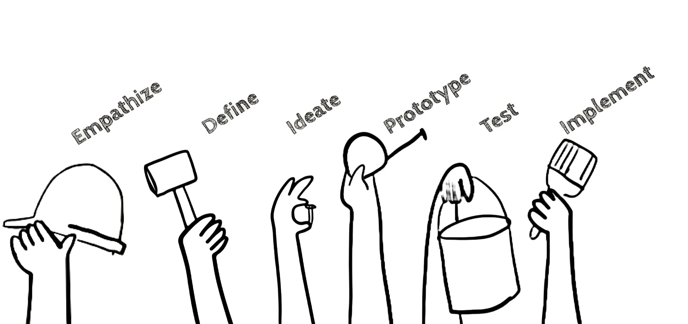
We embarked on a journey of empathy, understanding, and innovation, seeking to uncover the unique experiences and challenges faced by individuals managing their mental health.
Empathize
Understanding Mental Health Needs: Insights from Surveys and User Interviews
26
Survey Respondents
Interviews Conducted
8
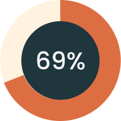
Users who encountered situations where they felt their mental health was not at it’s best

Users who are currently seeking mental health
Key Quotes from the User Interview
I want an app that can cater to individual behaviors and preferences.”
“
I want something all-in-one.”
“
Explain it to me like I’m a 5-year-old.”
“
After conducting interviews with 8 individuals and surveying 26 respondents, our team embarked on the next phase of our project: synthesizing the gathered data into actionable insights.
Define
Tranforming interview insights into actionable data
Understanding the Stories:
We meticulously transcribed and analyzed the interviews, diving deep into the stories shared by our participants. We also carefully reviewed the survey responses to complement our understanding of the human experiences behind the data.
Creating Clarity through Clusters:
Armed with our insights, we began the affinity mapping process. We clustered similar ideas together, giving voice to the common threads that emerged from our conversations. Each cluster was labeled with an "I Statement" based on the common themes.
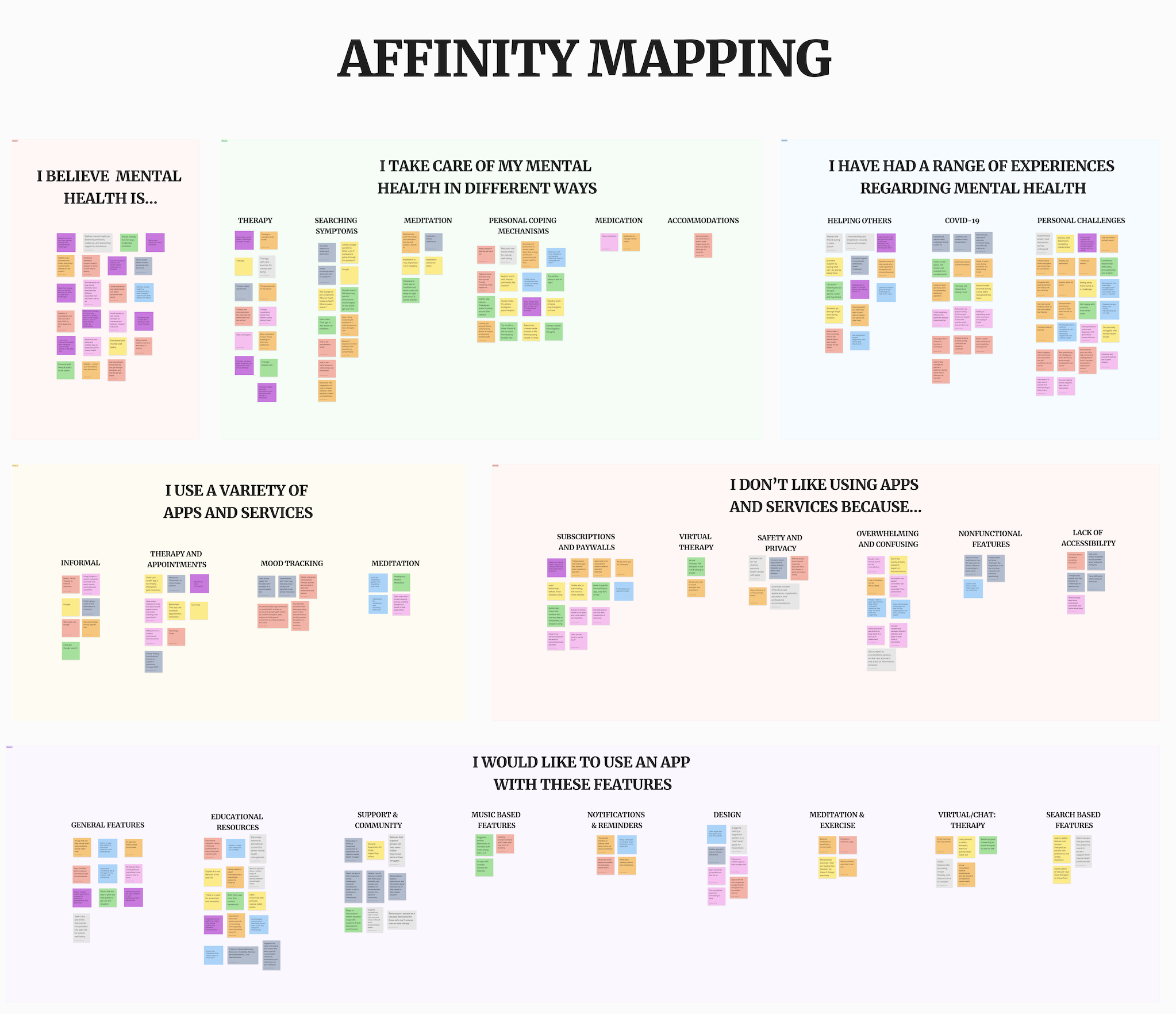
What we understood about them:
What they believe mental health is?
How they take care of their mental health in different ways?
What are their experiences with mental health?
What apps and services they’ve used?
What apps and services they don’t like and why?
What kind of app would they like to use and with which features?
After sorting through the data clusters on the affinity map, we delved into creating detailed profiles that truly captured the essence of our users. This profile was essentially a fictional character, but they were deeply rooted in the real experiences we encountered during our research.
Define
A Persona-Driven Framework to Understand User Needs based on our research
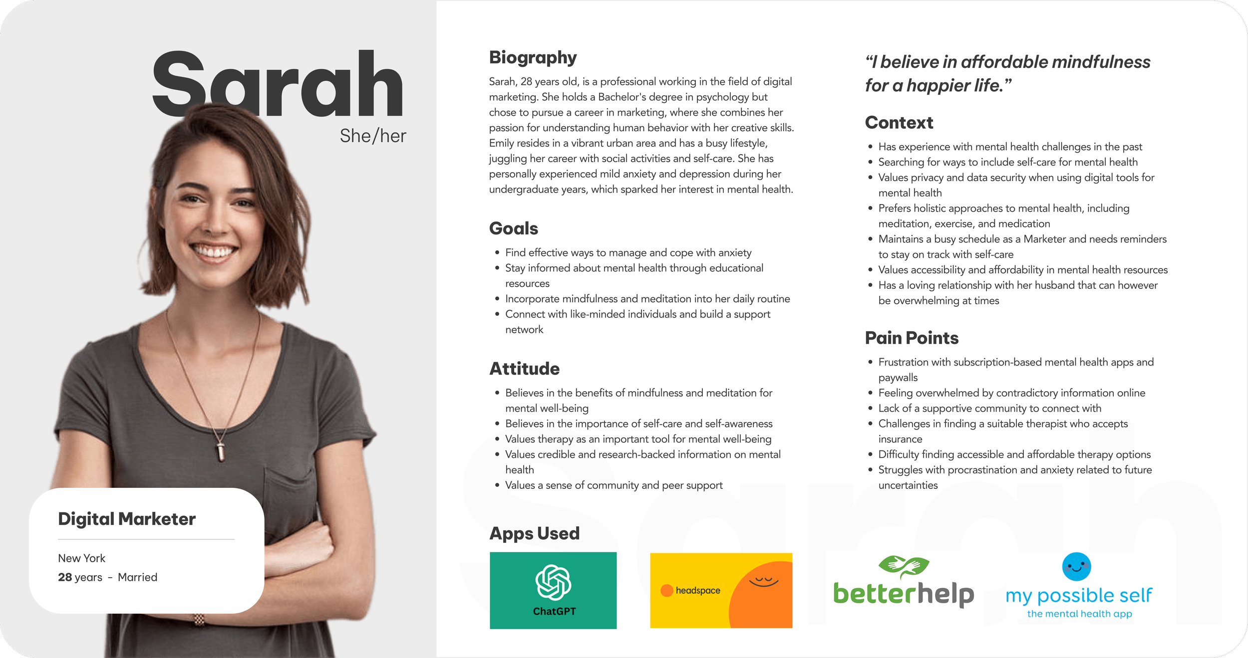
Sarah, a 28-year-old digital marketer from New York, is looking for an effective way to manage her mental health and coping from anxiety while staying informed through educational resources. She is searching for a way to explore self care and taking care of her mental health but she experiences pain points in terms of
Information that is overwhelming
Finds that therapy or relaxation resources are not accessible
Define
Unveiling Sarah's Mental Health Challenges Through Her User Journey
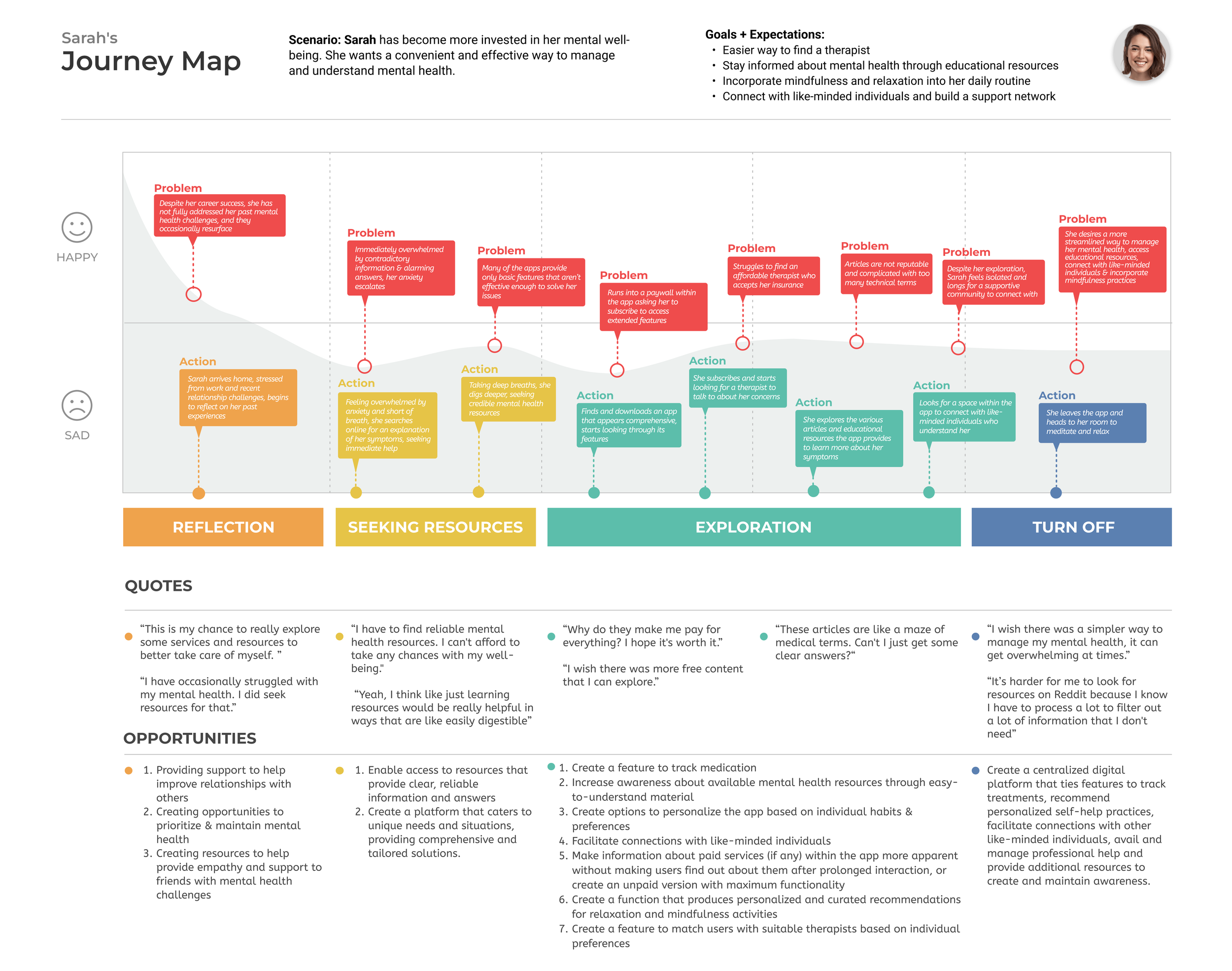
We then embarked on creating a user journey map for Sarah to delve deeper into her experiences and challenges. This mapping process allowed us to visualize Sarah's interactions with mental health resources, identifying key pain points and areas for improvement.
Sarah's journey underscored difficulties in accessing credible information, finding affordable therapy options, and fostering a supportive community.
A community to cultivate empathy within relationships, assisting friends facing mental health challenges
A user-friendly platform offering reliable, easily digestible resources tailored to individual mental health needs
An inclusive app- medication tracking, resource awareness, personalized relaxation recommendations, and therapist matching
Problem statements that guided our brainstorming process, driving us to explore innovative solutions tailored to Sarah's needs.
After analyzing Sarah's journey in the user journey map, we crafted a problem statement to encapsulate her challenges:
Problem Statement based on Sarah’s experience
As an individual facing mental health challenges, I want a more streamlined way to take care of my mental well-being so that I can live a happier and balanced life.
This statement encapsulated Sarah's longing for a comprehensive yet straightforward approach to addressing her mental health concerns. Additionally, we pondered over to find a solution to the question:
How might we provide an enhanced experience for Sarah to improve her mental well-being?
Ideate
Seeking Inspiration: Exploring Wellness Apps for New Perspectives
Lightning Demo
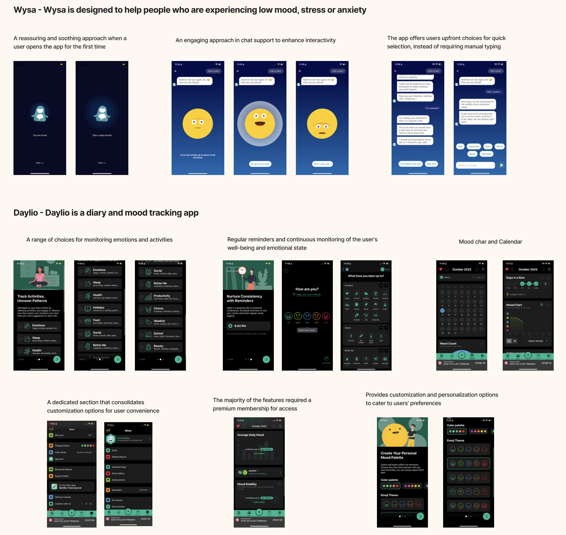
After setting our problem statement and considering our guiding question, we decided to dive into a lightning demo session. We wanted to explore what other apps and websites were doing in the mental health space. So, each of us went off to research different platforms like therapy apps, relaxation apps, mood tracking-based tools, and diary-journal tracking apps. Then, we came together to share our findings. It was a cool way to see what's out there and get some fresh ideas for our project
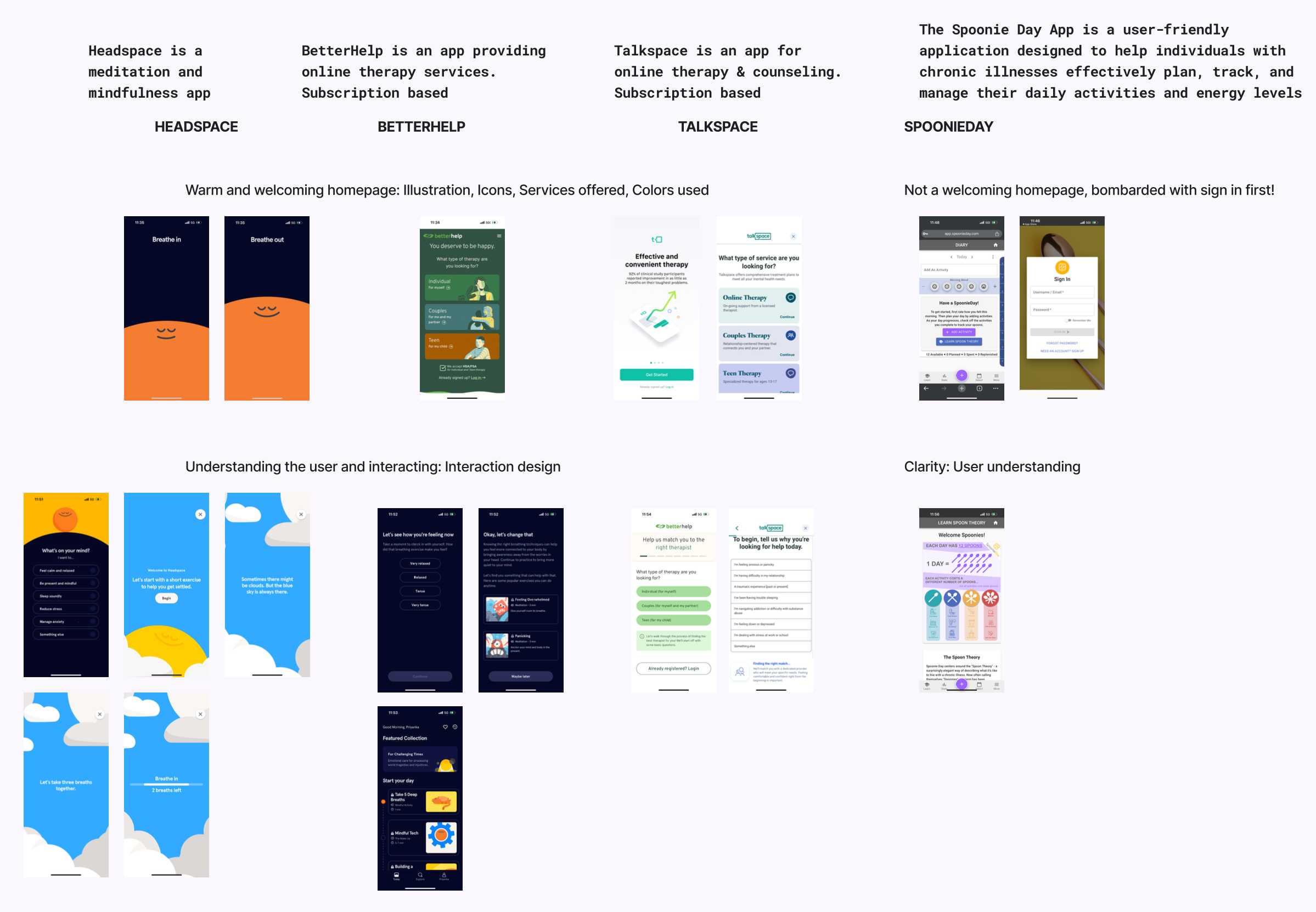
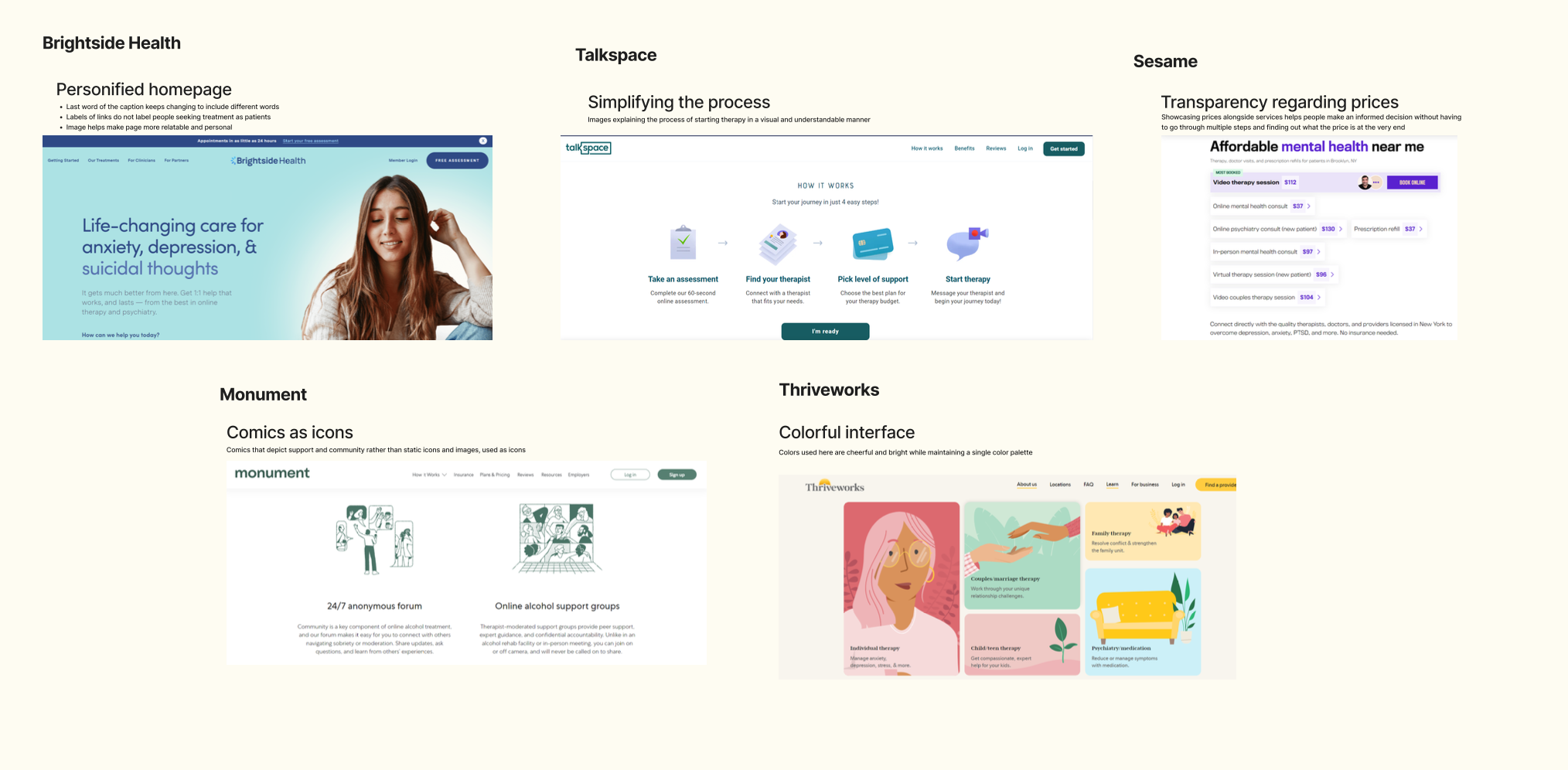
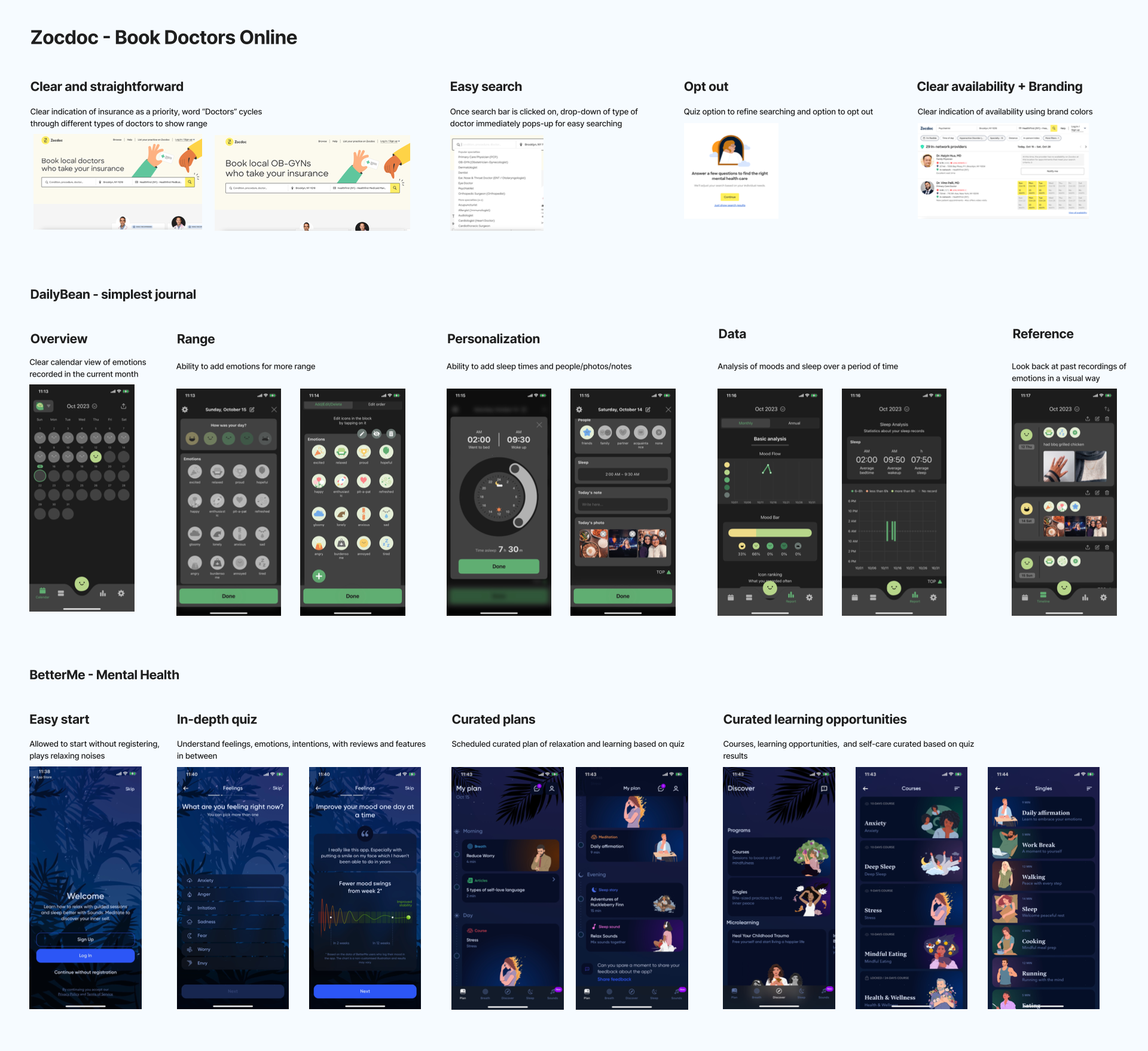
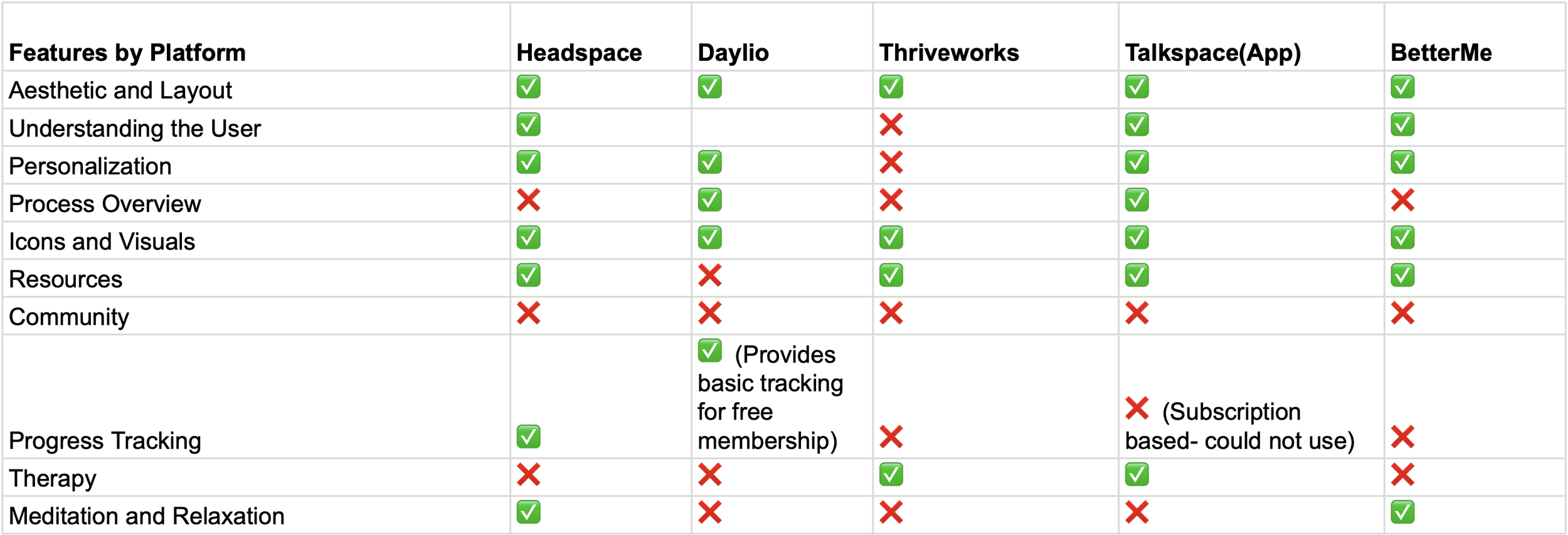
Competitive Analysis
After our lightning demo session, we delved into a competitive analysis, comparing key features across five platforms: Headspace, Daylio, Thriveworks, Talkspace, and BetterMe. This involved assessing various aspects such as aesthetic and layout, understanding of the user, personalization options, and available resources. By closely examining these platforms, we gained valuable insights into industry trends and user expectations, informing our design decisions for Mind&Me.
Ideate
Generating innovative ideas and mapping mental health concepts to address mental health challenges
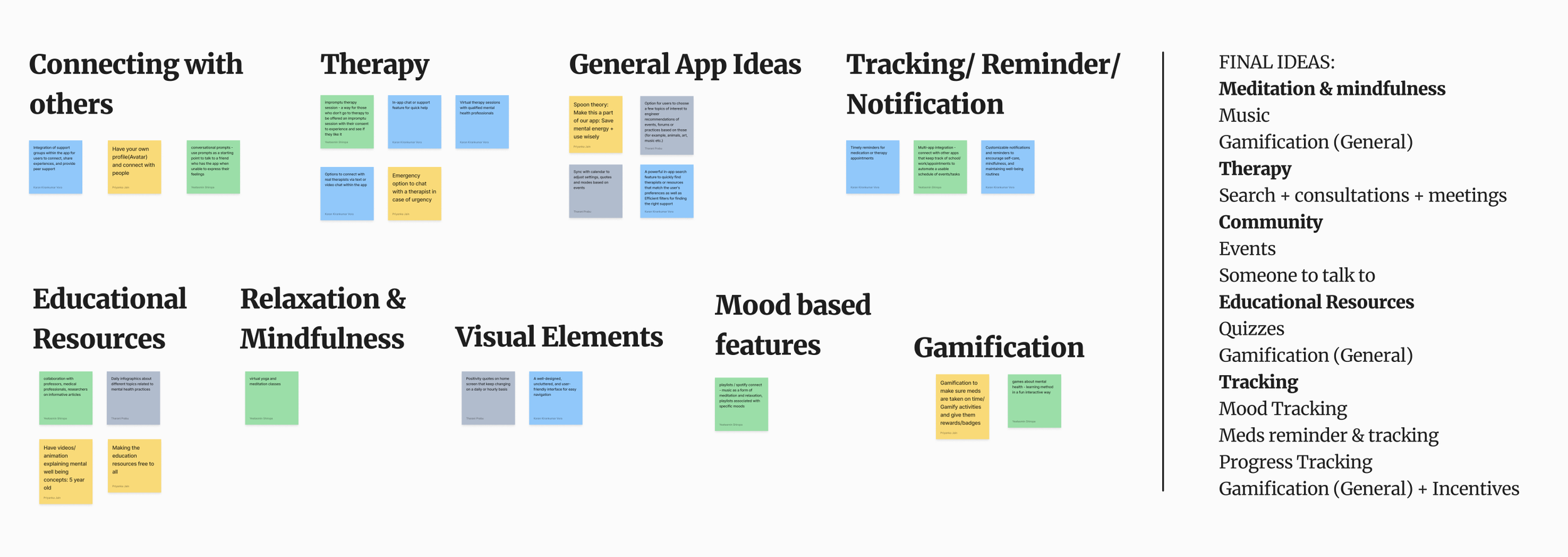
Brainstorm
After analyzing our competitors, we dove into a brainstorming and mind mapping session to spark creativity for Mind&Me. We brainstormed ideas like meditation, therapy options, community engagement, educational resources, and tracking features, aiming for quantity over quality at this stage.
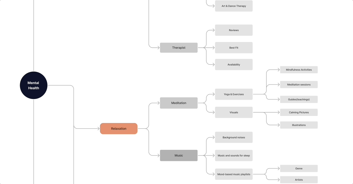
Mind Mapping
Then, we visually mapped out interconnected concepts under the central theme of "Mental Health," branching into incentives, therapy, relaxation, medication, awareness, and support. This collaborative process allowed us to explore diverse possibilities and visualize how different aspects could interconnect within our app, setting the stage for further development.
Sketching
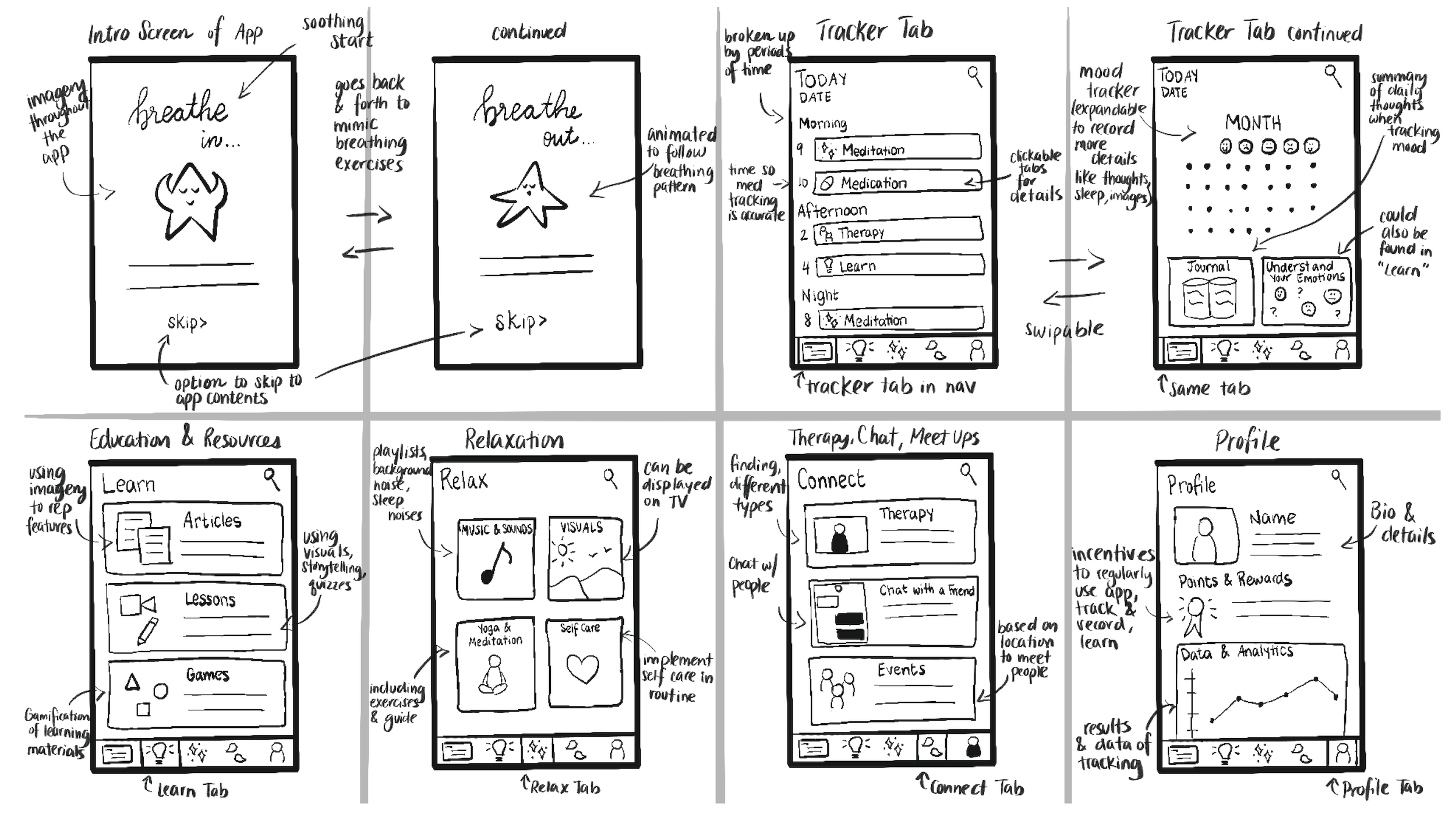
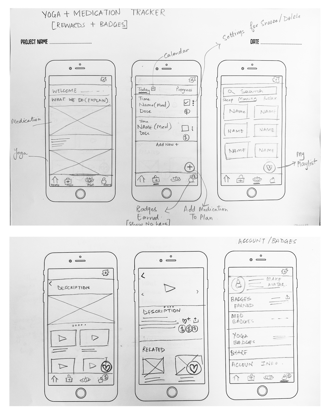
Based on our brainstorming concepts, we dove into sketching. This was where we took all those exciting ideas we generated and started putting them on paper. The sketches weren't perfect, they captured the raw ideas of our vision in visual form. We kept our wireframe sketches simple, iterating on our designs until they felt right. It was in this phase that we witnessed our ideas truly taking shape, laying the foundation for the Mind&Me experience.
A one-stop platform for all things mental health
Based on our extensive research, we devised a comprehensive solution—a one-stop platform for all things mental health. Our goal was to create a personalized, all-in-one platform that alleviates the stress of searching for resources and provides easy access to essential tools.
Here are the key features we incorporated into our solution
Users can journal their daily mood and log their sleep hours to gain insights into their mental well-being and identify patterns
Users can match with therapists based on their preferences, schedule appointments, and track their progress through therapy sessions
A curated library of resources to help users understand mental health concepts. Customizable content based on preferences
Relaxation methods such as meditation, breathing exercises, & nature sounds, along with guides for support
After mapping out our solution's features, we moved on to creating mid-fidelity wireframes.
Establishing App Structure and Navigation with Mid-Fidelity Wireframes
Prototype
These wireframes served as a blueprint for the app's structure and layout, without getting into the details of design elements. It was a crucial step in refining the user experience & ensuring that our app would be easy to navigate.
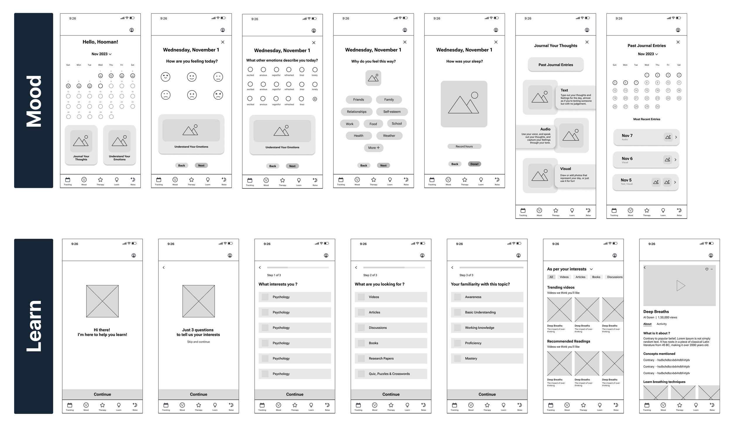
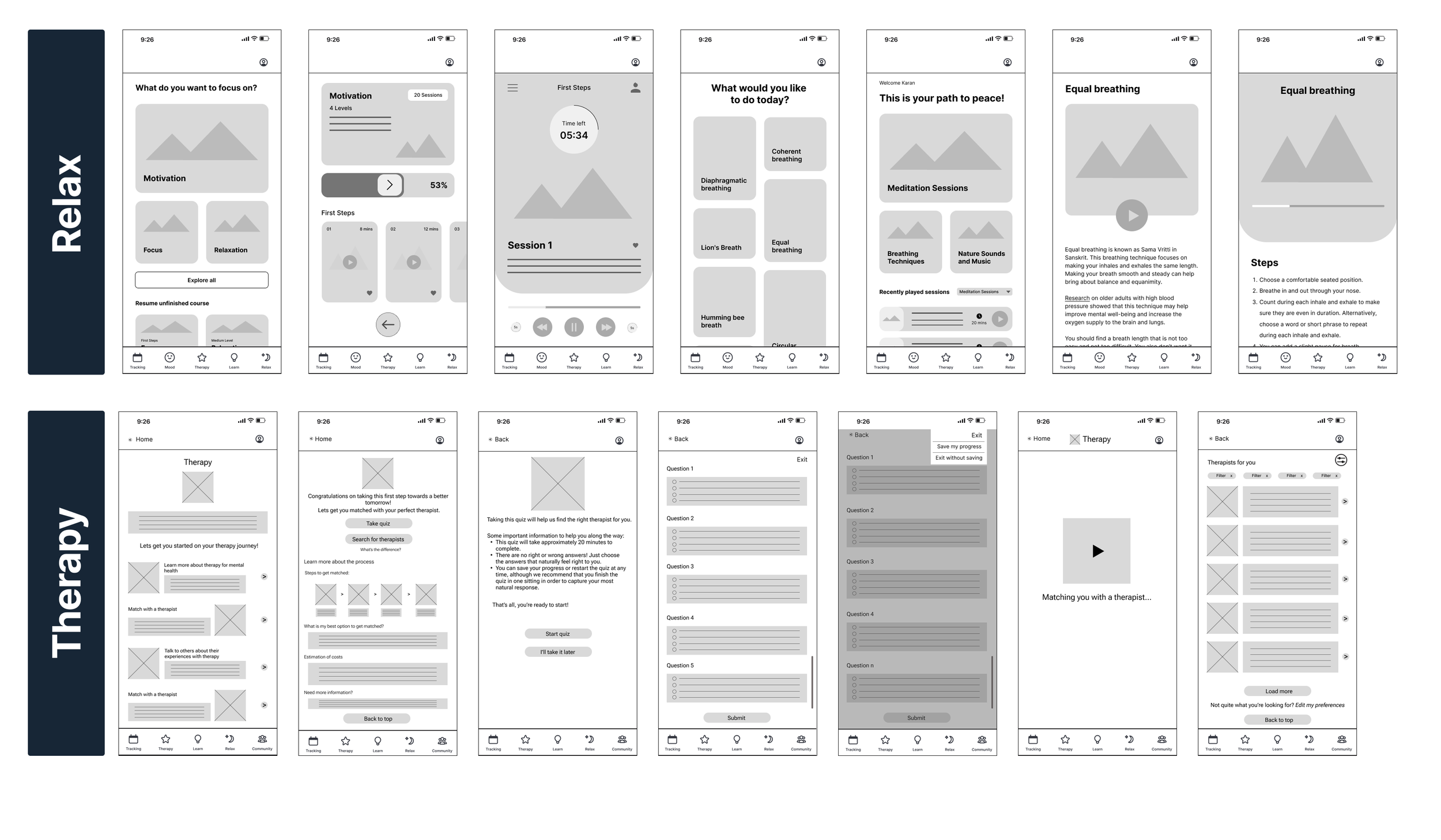
It was like sketching out the skeleton of our app. We used grayscale tones to outline different sections and functionalities, focusing on clarity and functionality rather than aesthetics.
Ensuring Visual Consistency: Crafting a Style Guide for Unified Design
Following the creation of mid-fidelity wireframes, we transitioned into crafting a style guide to establish visual consistency across the app. This involved defining brand colors, including primary, secondary, and accent colors, as well as selecting typography(Poppins and Hind) to ensure uniformity in text styles.
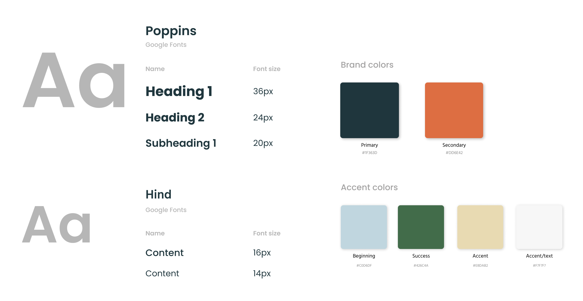
This style guide served as a comprehensive resource for our design team, providing clear guidelines on how to use UI elements consistently throughout the product.
Prototype
Transitioning to Early High-Fidelity Wireframes for User Testing
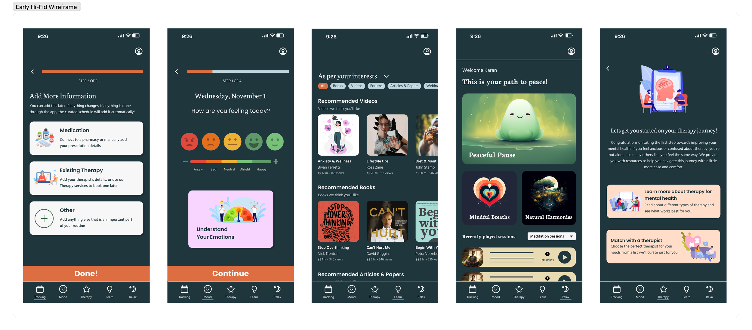
We advanced from mid-fidelity wireframes to early high-fidelity ones, using our style guide for consistency. These refined designs were geared for user testing, aiming to improve user experience with functional and visually appealing interfaces.
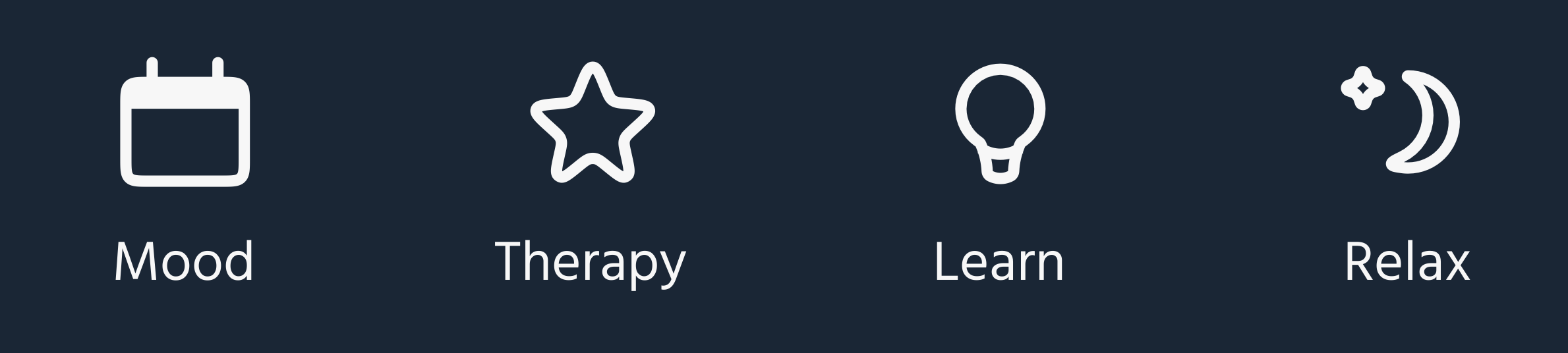
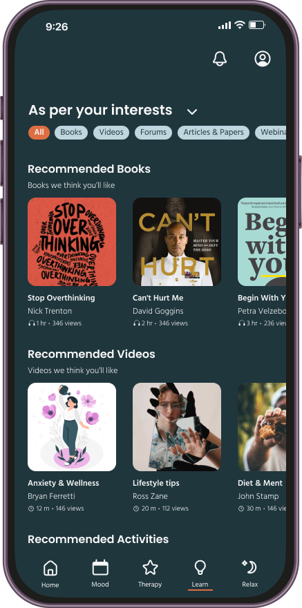
Left to Right Wireframes(one of each section)Tracking, Mood, Learn, Relaxation, Therapy
Test
Identifying Areas for Improved User Experience to Refine Mind&Me
After creating early high-fidelity wireframes, we embarked on comprehensive user testing covering aspects like the navigation bar, curated schedule, and pivotal features such as Therapy, Learn, Relax, and Tracking. Our approach involved a combination of remote and in-person sessions, enabling us to meticulously evaluate user experiences and document valuable feedback.
Stoplight Chart of Task Completion
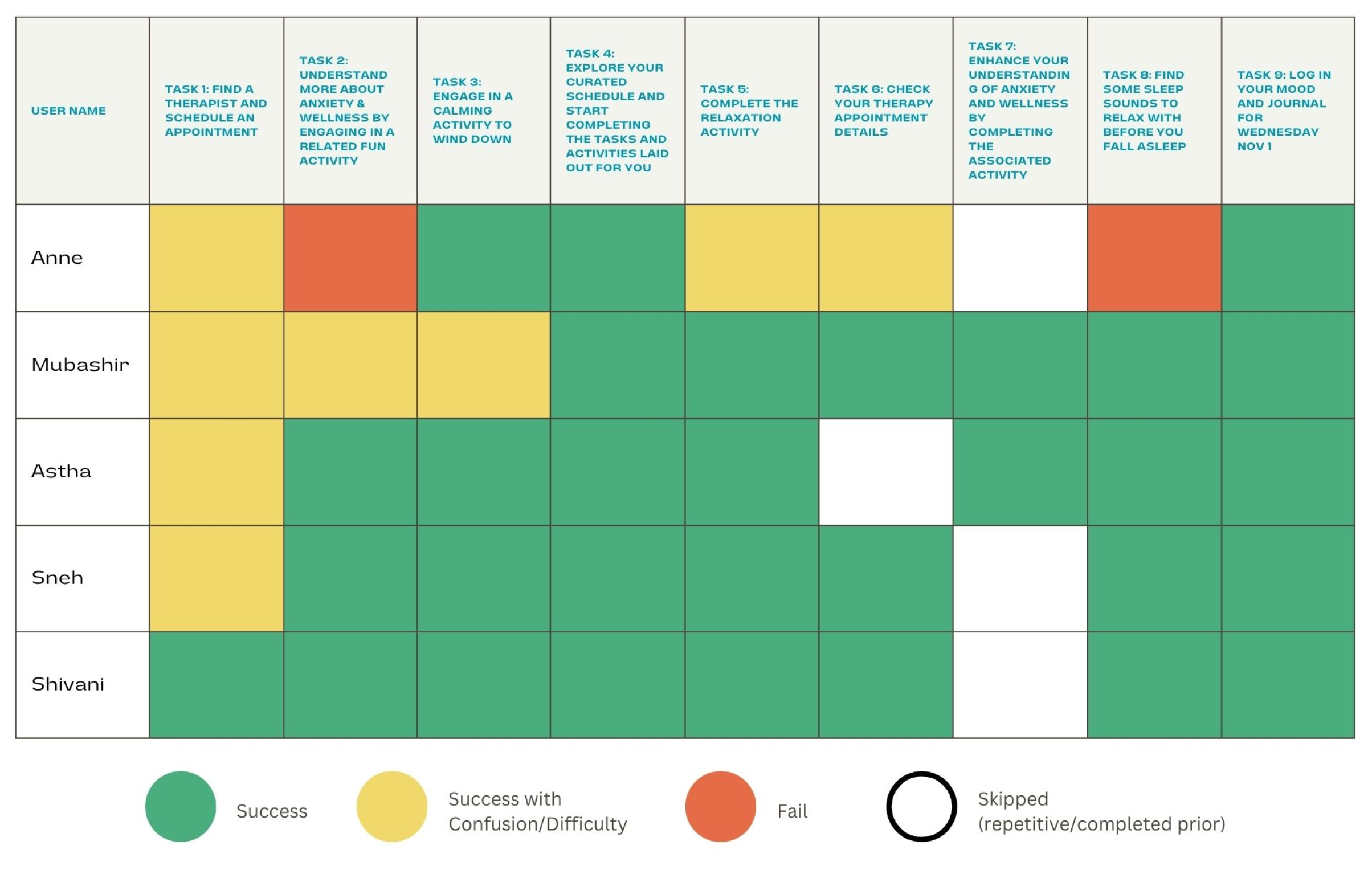
Some users found task sequencing confusing, especially with the landing page's focus on the tracking quiz. Feedback emphasized the need for personalization options in the "Tracking" feature, clearer organization in the "Learn" section, refined wording in "Therapy," and improved clarity in "Relax
What went well:
Users praised the app's visual style and easily understood its purpose.
Engagement was high with quizzes and content in "Learn," "Relax," and "Journal" sections.
Positive feedback emphasized the app's aesthetic appeal and the value of its educational resources.
Most tasks were successfully completed, with users particularly enjoying the app mascot and animations.
What needs Iteration:
Tracking: Enhance manual personalization options and consider positioning this feature as a homepage.
Learn: Improve visibility of the activity section and align content with quiz choices for clarity.
Therapy: Condense wording and refine flow for improved user understanding.
Relax: Clarify information and provide indicators for better user guidance.
Through this rigorous testing and insightful feedback, we were committed to refine Mind&Me to deliver an intuitive and enriching user experience.
After listening to user feedback and making necessary adjustments, we moved on to creating the final prototypes.
Unleashing Mind&Me’s Final Prototype - Bringing Ideas to Life
Implement-Test
This was an exciting phase where we aimed to bring our design vision to life. We carefully incorporated brand elements like colors, icons, and logos to ensure consistency and authenticity. The final prototype represents the culmination of our efforts, reflecting the user-centric approach we've embraced throughout the design process.
Test
Iterative User Testing for Optimal Mental Wellbeing App Experience
Following the development of the final prototype, we sought feedback from select participants who had previously engaged in user testing. Their insights provided valuable perspectives on the improvements made.
Key Quotes from the user test
“
It’s much nicer to look at now that there are fewer buttons here.”
The flow is much easier to navigate now, and some redundant things have been removed.”
“
A very smooth flow, I didn’t have to think about things too much this time.”
“
Future Enhancements of Mind&Me
In planning for the future several key insights and recommendations emerged:
These enhancements will elevate Mind&Me's capabilities, making it an even more valuable companion on the mental well-being journey.
1
Develop app further to achieve full working functionality in sync with external resources.
2
Offer personalized daily affirmations and positive reminders to boost users' mood and motivation
3
A peer support network for users to connect with like-minded individuals with similar challenges and receive peer support through social features
4
Introduce goal-setting features to motivate users to engage in healthy habits & self-improvement activities, rewarding them for their progress