Revamping the Girl Scouts(GS) Website: A Quest for Seamless Navigation and Enhanced User Experience for Parents
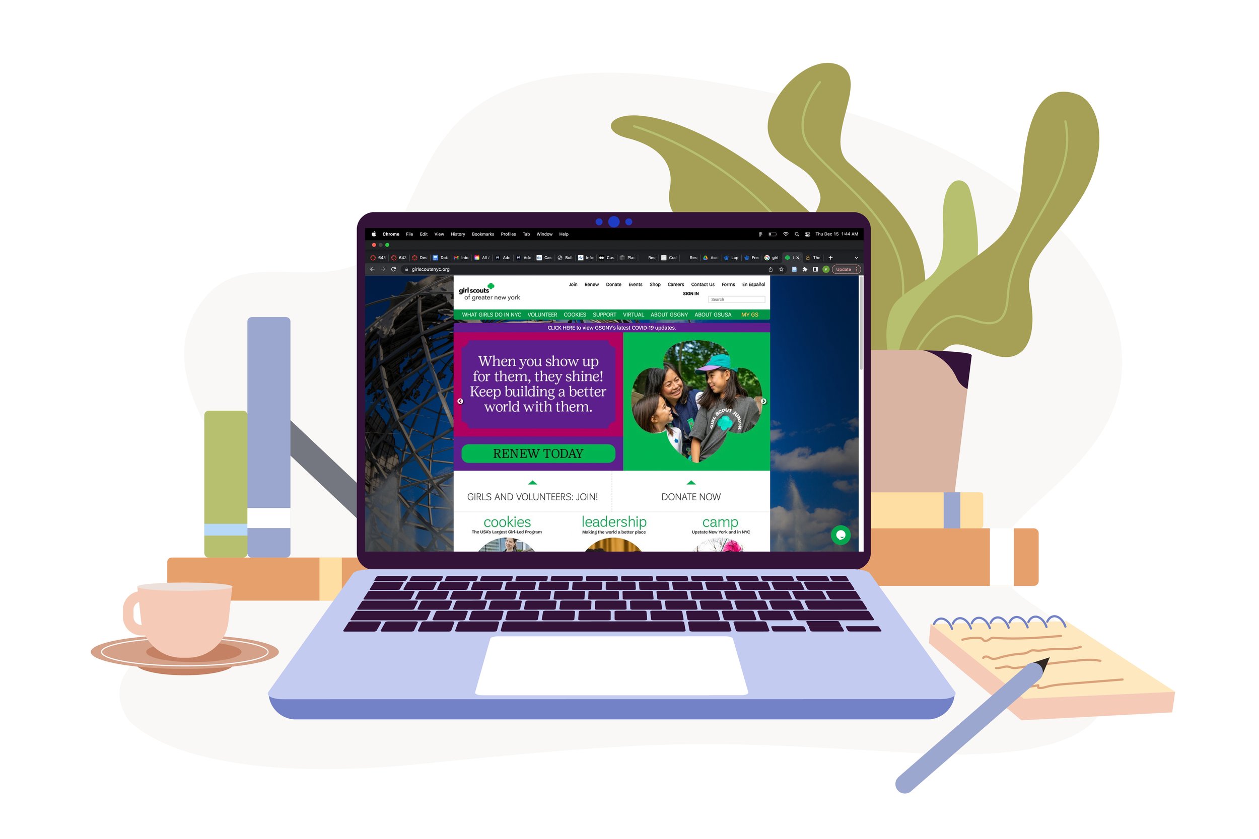
Girl Scouts of Greater New York is a platform that builds girls of courage, confidence, and character, who make the world a better place. They are backed by trusted adult volunteers, mentors, and millions of alums. The primary source of information for them is the Girl scouts website. This website provides the users with details on upcoming activities, events and programs, volunteering details, cookie resources, donation, awards and badges, troop leadership and so much more. Unfortunately, we found that accessing this hub of information(the website) was a frustrating process and therefore our team decided to re-structure and revamp the site to make it more effective and enjoyable for the user.
Target User
Our primary user group consisted of parents, who are the backbone of the Girl Scouts organization and played a pivotal role in using the GS website.
Seamless Interaction and Intuitive Navigation for Enhanced User Engagement
In today’s world, which is synonymous with technology, a robust web design is far more than a status symbol. The users have pretty high hopes when it comes to the usability and expect it to adapt seamlessly to every screen, navigate effectively and be easy to access. If not, the user, frustrated, might leave the website and look for an alternative. After interviewing parents of GS, we found the problem to be similar as they found the website to be poorly designed and difficult to access.
My team and I followed the user centered design process where we generated an information architecture by conducting research and competitive analysis, then created task flows, sketches, wireframes & prototypes and went back and forth after evaluating them to finalize a possible solution.
Our aim was to make the user's experience effortless, useful, usable and enjoyable.
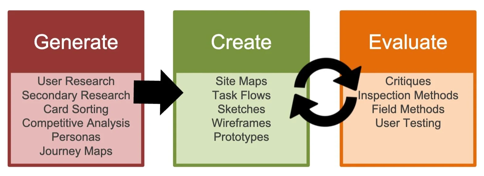
The design process
Overview
Our team's mission was to enhance the website for parents encountering usability challenges. We used a user-centered design approach, conducting research and refining our designs through iterative processes. This led to significant improvements in website accessibility, navigation, and labeling, making it more user-friendly.
METHOD Research & Design
PRODUCT TYPE Website (Desktop & Mobile)
HYPOTHETICAL CLIENT Girl Scouts of GNY
TIMELINE Sept - Dec 2022
TEAM Priyanka Jain (me)
Tanmaya Jyothula
Sara Kim
Jeany Lee
Jolie Leung
MY ROLE UX Designer & Researcher
TOOLS Miro, Figma, Optimal workshop
Let's dive right in the process…
What are the challenges when using the GS website - Let's Empathize!
A. Uncovering User Struggles: Understanding GS Website Issues Through Interviews
We kicked off our project by immersing ourselves in understanding the GS website. This helped us shape an interview plan specifically designed for our target users. Since we're all about user-centered design, we interviewed five parents who had their children in GS or a similar program.
B. Understanding Their Perspective: Extracting Insights from Interviews and Surveys
After wrapping up our interviews and collecting valuable user research data, we rolled up our sleeves to analyze and distill these findings. Our aim was to gain a deep understanding of our user’s needs and behaviors.
Now, it was time to put our insights to work. We had to ensure that our research findings reached the right ears - stakeholders, clients, & developers. We introduced them to our target user group, explained the methodology behind our data collection, and presented the results we uncovered.
Key findings presented to stakeholders:
Accessibility: Accessing the website is a task because it crashes and there is no immediate support
The Yearning for Excellent UX: Users preferred a seamless user experience, both on the website and through phone notifications.
The Unloved Volunteer Toolkit: Users expressed dissatisfaction with its lack of interactivity and its poor design.
FB Groups Over Website Updates: Many users preferred FB groups for activity planning, sidelining the official Girl Scouts website.
Scarce Volunteers for Activity Planning: The shortage of volunteers who could dedicate time and knowledge to planning activities had negative repercussions for the children.
Missing Information on Badge & Activity Preparation: Users struggled to find detailed information on how to prepare their child for activities and how children should wear the badge.
Timely updates: Users wished for prompt notifications about upcoming activities, location changes, and timing adjustments.
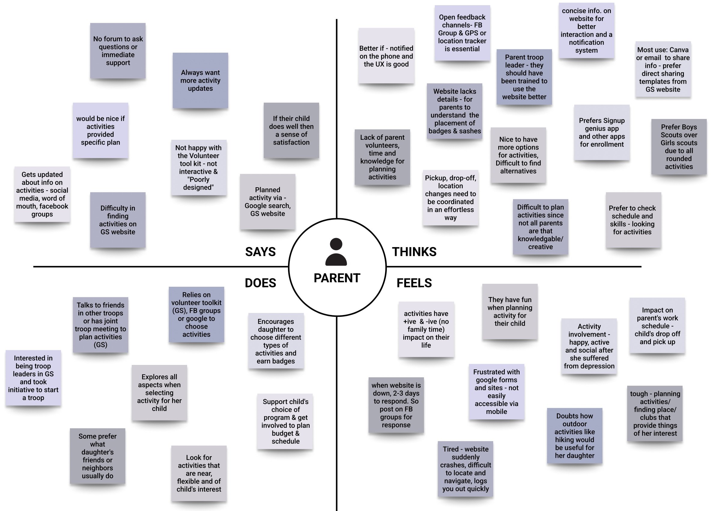
Empathy mapping
C. Paving the Path for Improvement: Bridging User Insights to Stakeholders
A Glimpse in Our User’s World: Discovering Pain Points, Desires, & More
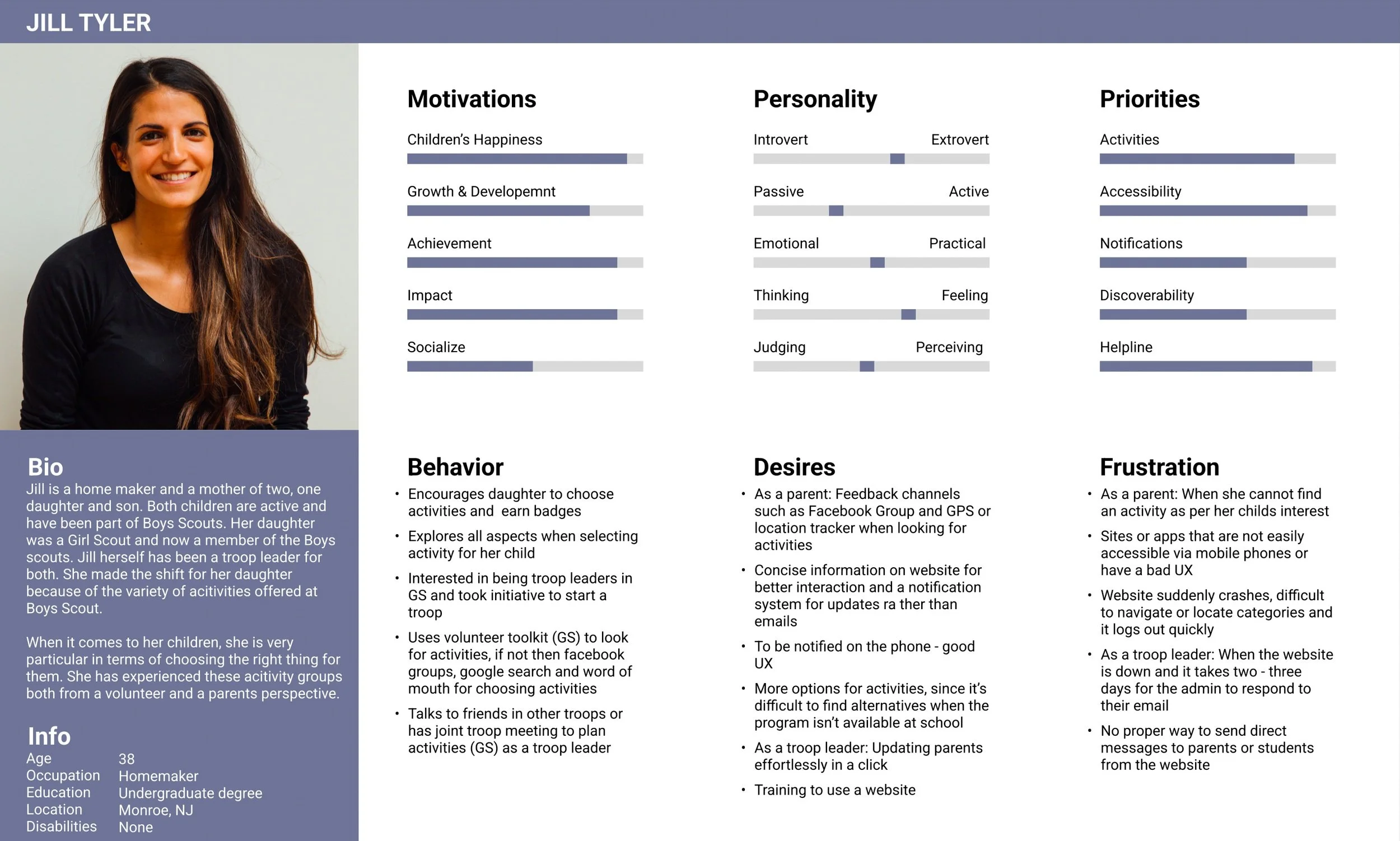
User Persona
To make our insights more relatable, we crafted a persona. This lifelike character emerged from the insights we gathered, presenting a clear and humanized view of our user group. Our persona narrated the tale of our user group – their behavior, thinking, desires, pain points and wishes.
Enhancing Parent’s Website Experience Through Content Restructuring
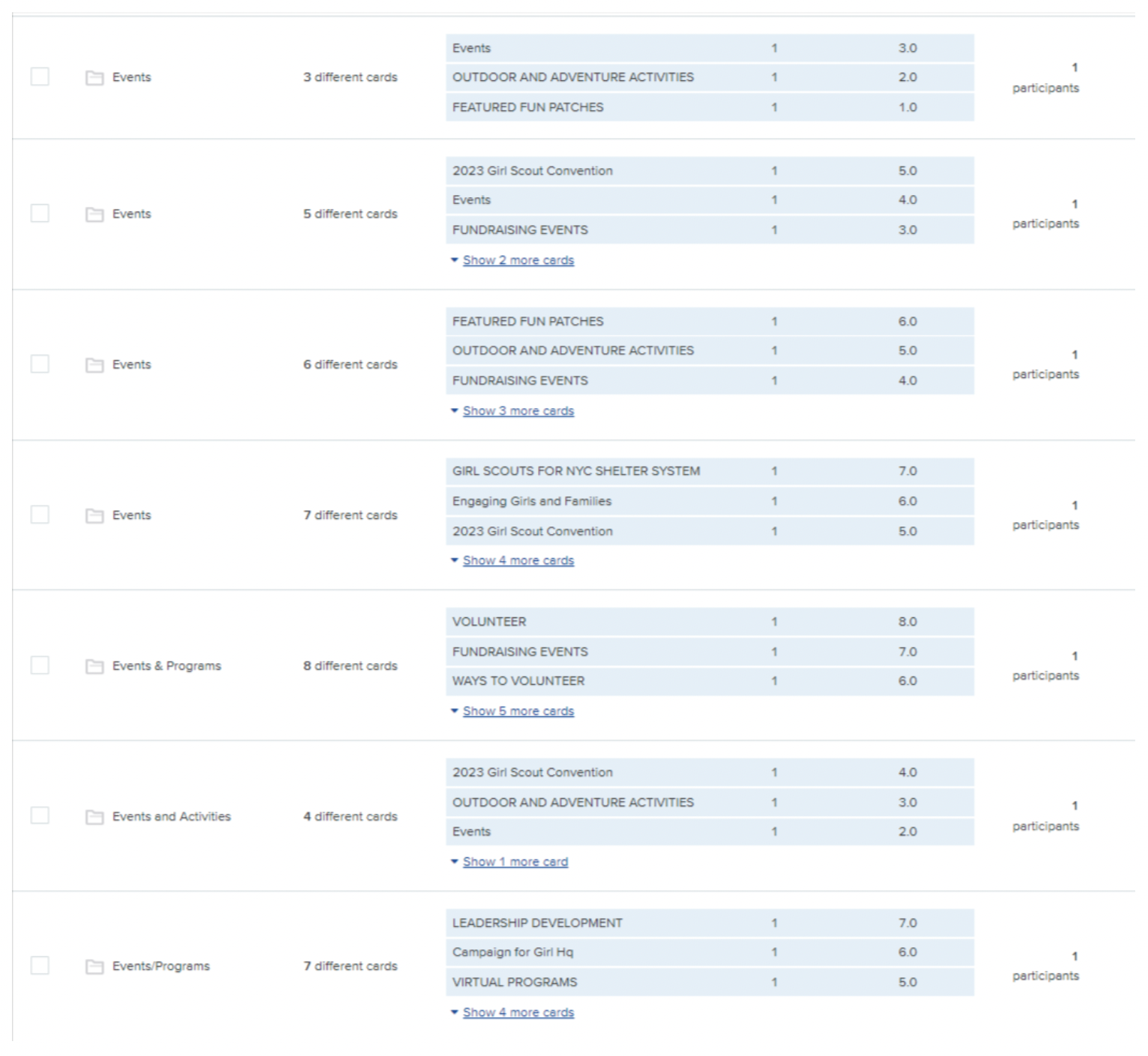
To ensure our website served our users' needs effectively, we investigated their motivations and analyzed their interactions with the site across various scenarios. To get our categories and labels just right, we employed card sorting method, using the Optimal Workshop software, to gain insights into how users naturally organize and name the website tags.
Proposed new categories
Key findings of card sorting:
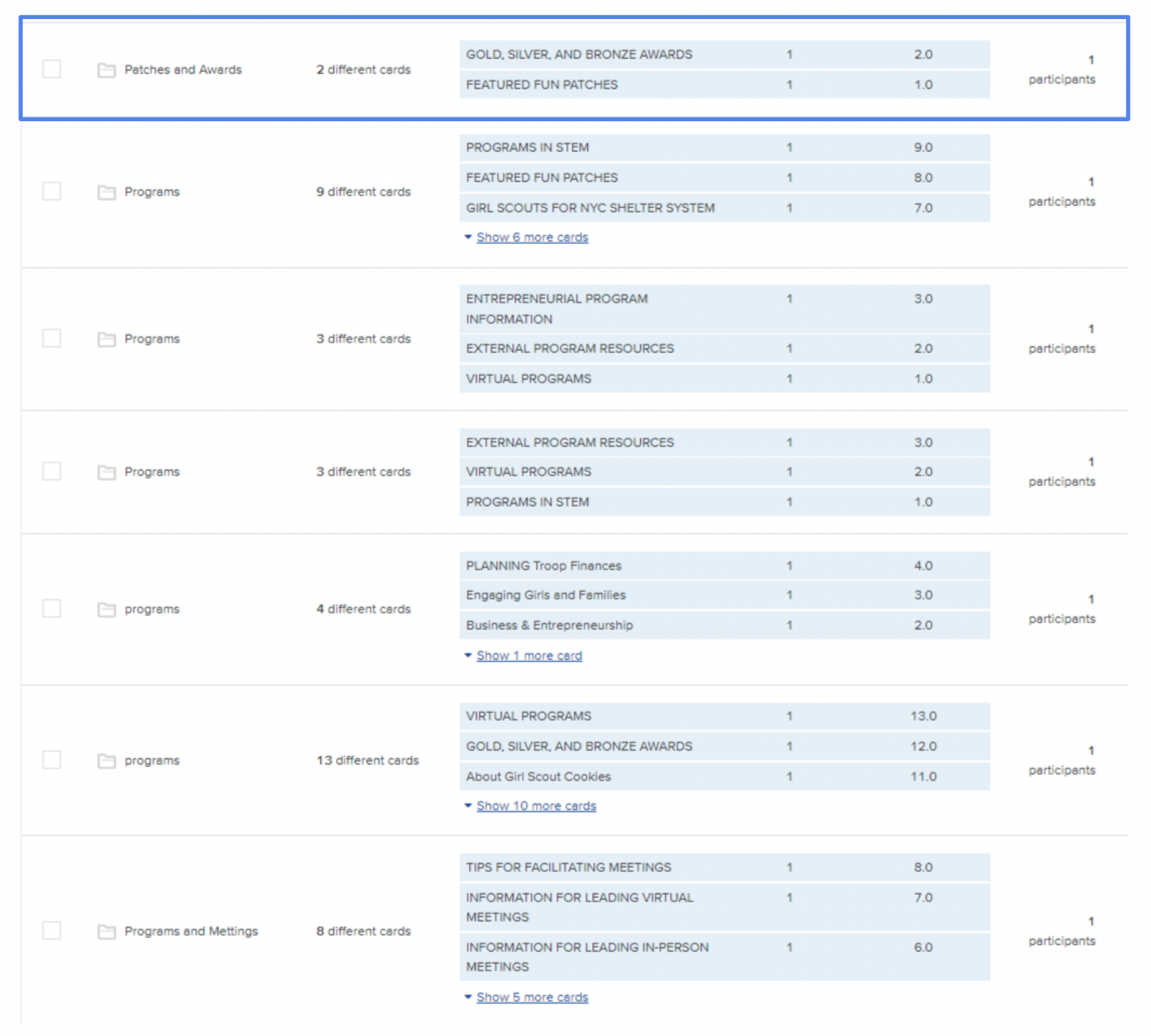
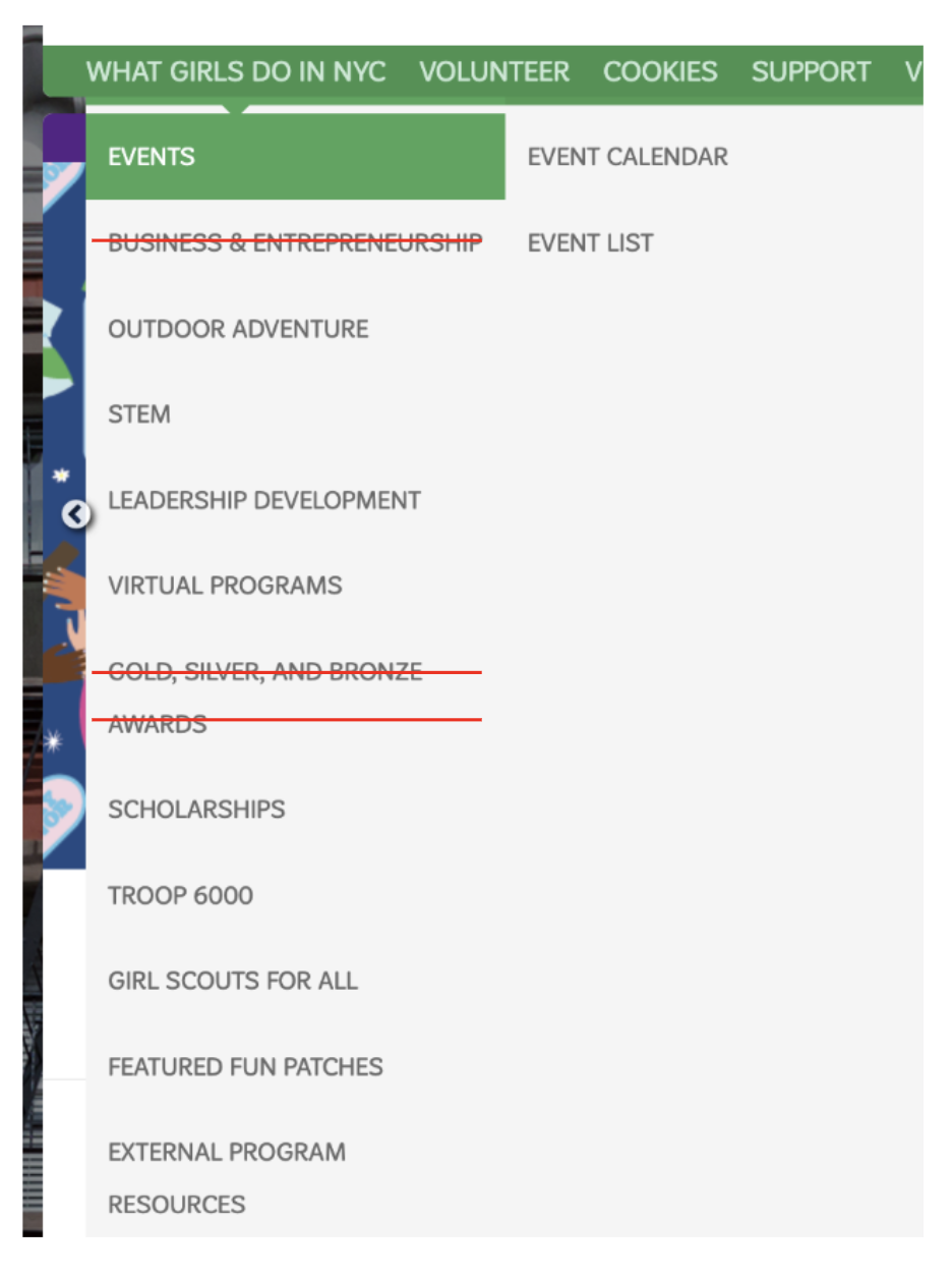
Patches & Awards category created. GS website original category (Right)
Participants felt overwhelmed by the volume of information.
Labels needed revision for better clarity.
Participants proposed new categories like "Programs”, “Events", "Awards," "Volunteers," and "About Us." (Above left)
Participants created a new "Patches & Awards" category, reassigning "Gold, Silver, Bronze awards," and "Featured fun Patches" from the "What Girls Do in NYC" category (Above right)
Following our adjustments based on the insights from card sorting, we reorganized the categories and then moved on to the tree testing phase. This involved giving participants specific tasks to observe how they navigated the website and whether they could easily find the information they were seeking.
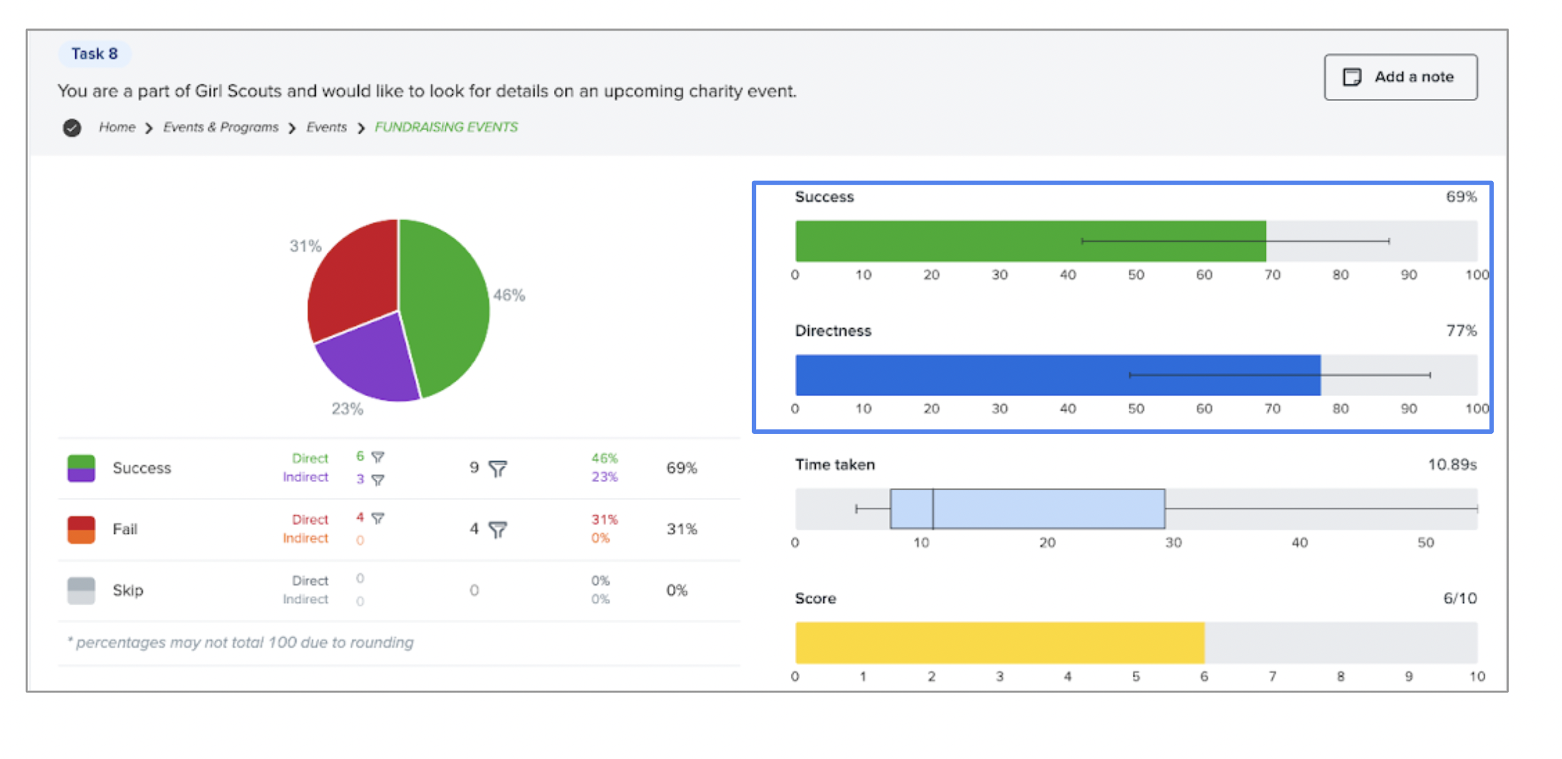
Our tree testing results effectively validated the usability of our categories and labels. The example provided above illustrates how participants seamlessly located details about an upcoming charity event.
Tree map test snapshot
Unlocking potential: Finding inspiration & enhancing experiences
Alongside our tree testing phase, we conducted a competitive analysis to refine the Girl Scouts website. We rated competitors based on various criteria, providing us with valuable insights for optimizing navigation and content organization. This phase allowed us to identify elements we liked and disliked on competitor’s websites. We drew inspiration from this analysis to enhance our platform, aligning with our goal of delivering an exceptional user experience.
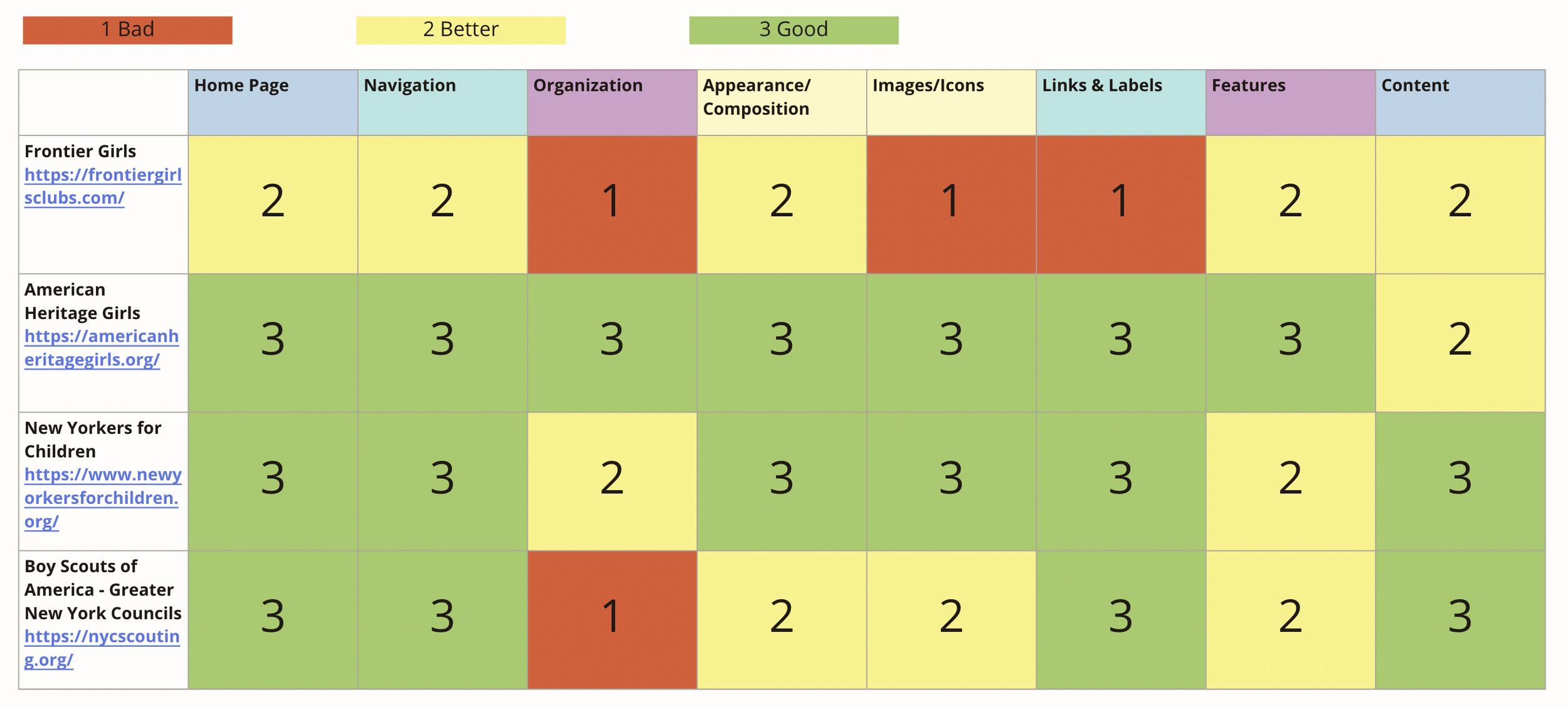
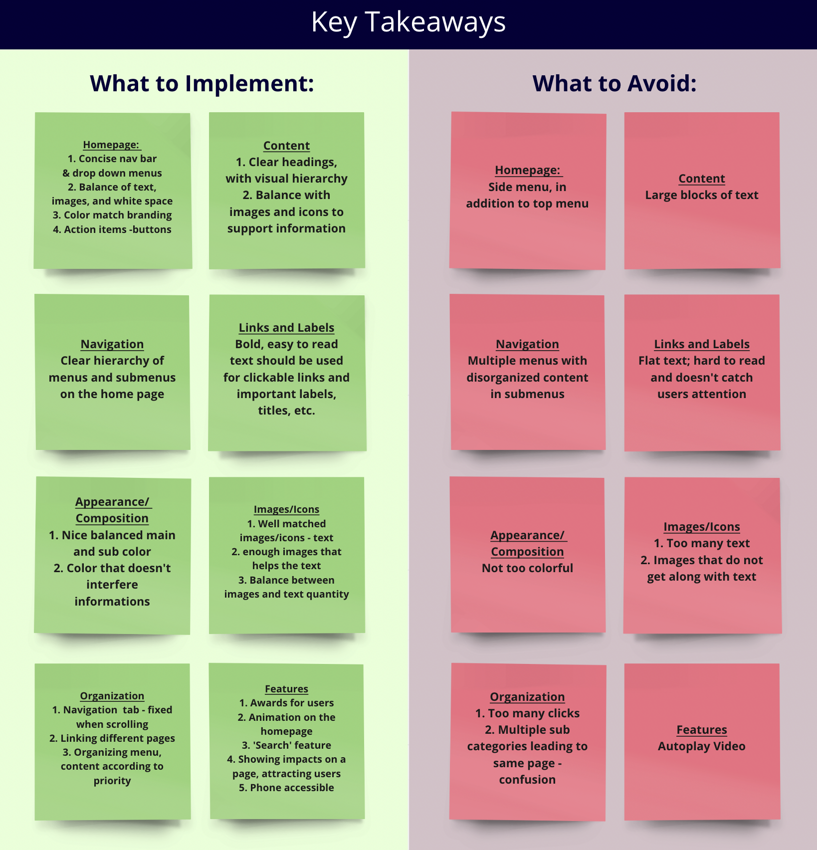
Rating our competitors based on different dimensions(Above) and our Takeaways(Right)
This phase connected tree testing insights with competitive analysis, drawing inspiration from successful competitors and merging it with our tree testing findings, we then created a user-centered site map.
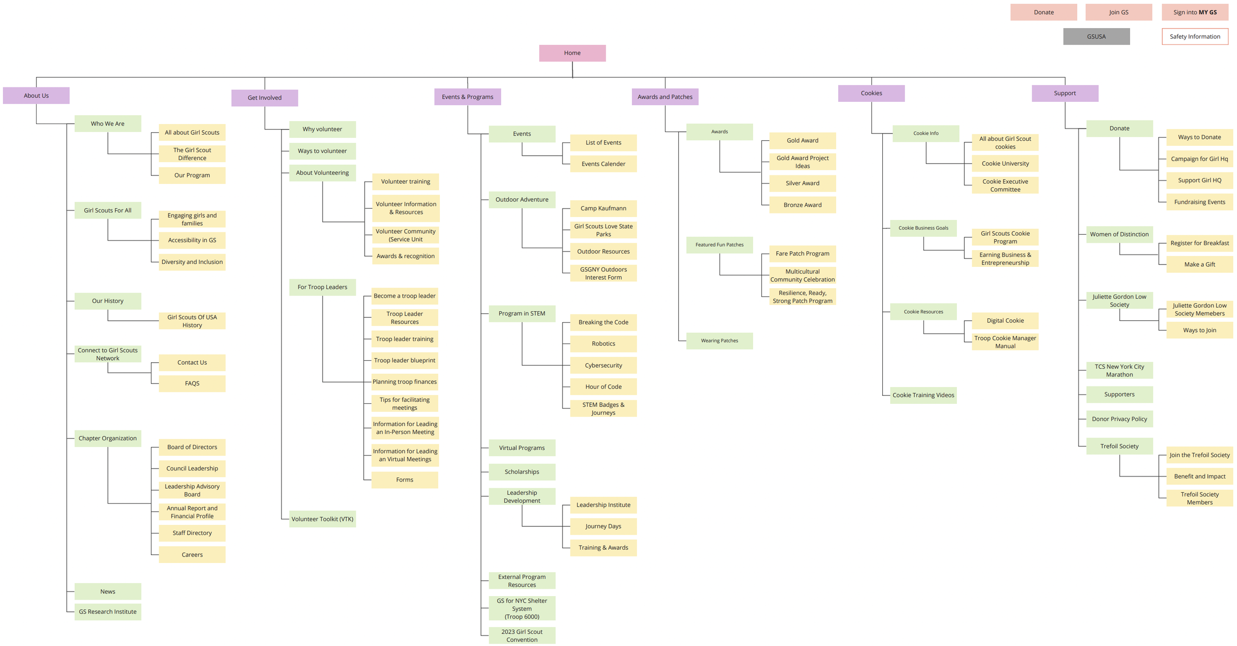
Proposed new Site Map for GS of GNY
Design, Evaluate & Iterate: Lead users to Cookies & Cybersecurity effortlessly !
With a clear plan in mind, we moved on to visualize our ideas. We focused on creating wireframes and prototypes to ensure the user experience was well-designed. Due to time constraints, we narrowed our wireframing down to two essential tasks. These tasks were carefully selected based on the Minimum Viable Product (MVP) concept, guided by our user story map. The chosen tasks directed users to the Digital Cookie, Cookie Training Videos, and STEM-Cybersecurity program pages. We also ensured responsive design, making these tasks accessible on both desktop and mobile. This step was all about making our ideas visual and user-friendly.
The Tasks
Find & register for the Cyber Security Program
Find information for selling cookies online (should end up at "Digital Cookie") & access training videos to sell cookies
A. Sketch
Our team initiated the process with low-fidelity sketches for the mentioned tasks. Some of us preferred hand-drawn sketches, while others developed rough wireframes using Figma.

Sketching proved to be a highly effective method for saving time, exploring various design options, and brainstorming better solutions. One important element we introduced was the dropdown and filter options.
B. Low fidelity wireframes and User testing
Sketch options proposed by our team
Subsequently, we created two low-fidelity prototypes - one for desktop and one for mobile, each designed to support the two tasks. We conducted five user tests per team to identify any notable usability issues and meticulously documented our findings. After the tests, our users provided valuable feedback on how to enhance the user experience.
Confused with Digital cookie name, suggests Selling cookie online
Suggestions for having sub-menu options on the top of the landing page
Request for a "Back" button or direct access to the homepage.
Users sought guidance on where to click for selection, image or label
Request for detailed submenu information, especially for STEM programs
Desire for a more functional Prototype
User test: Cookie task on desktop
C. User testing overall findings
User's Final Destination : A SEAMLESS USER EXPERIENCE
Our goal was to create a user-centered solution to improve the user experience. Below are the desktop & mobile prototypes we designed for the tasks we had in mind. Additionally, we shared these with other teams to gather valuable insights.
Task:
Find information for selling cookies online & access training videos to sell cookies
Task:
Find & register for the Cyber Security Program
MOBILE PROTOTYPE
DESKTOP PROTOTYPE
The Why’s Behind Our Design: Strategic Design Choices
Our journey towards a user-centered solution was marked by thoughtful design choices and considerations. In this section, I’ll provide insights into the key annotations that drove our decision-making process.
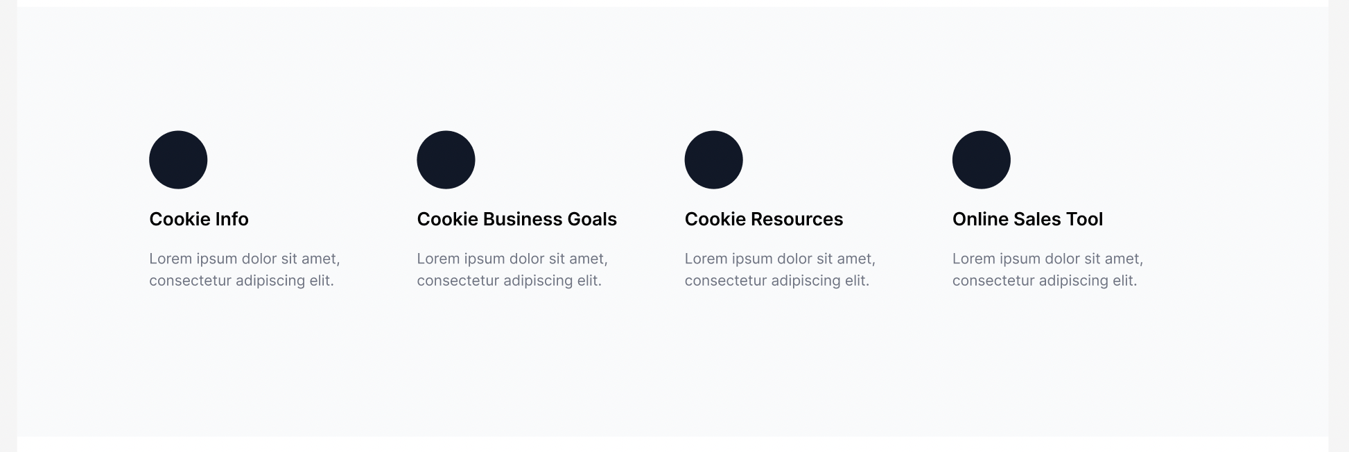
1. Consolidated Top-Level Menu Options
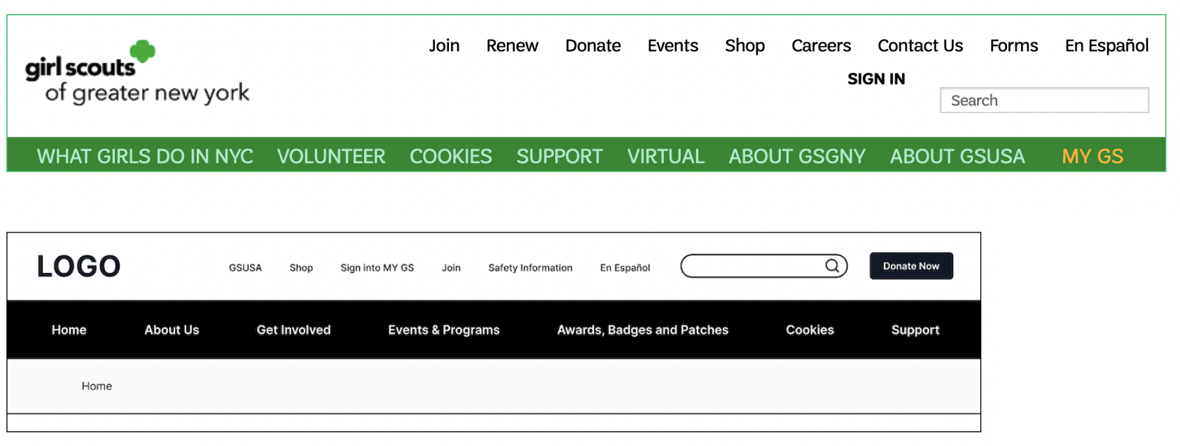
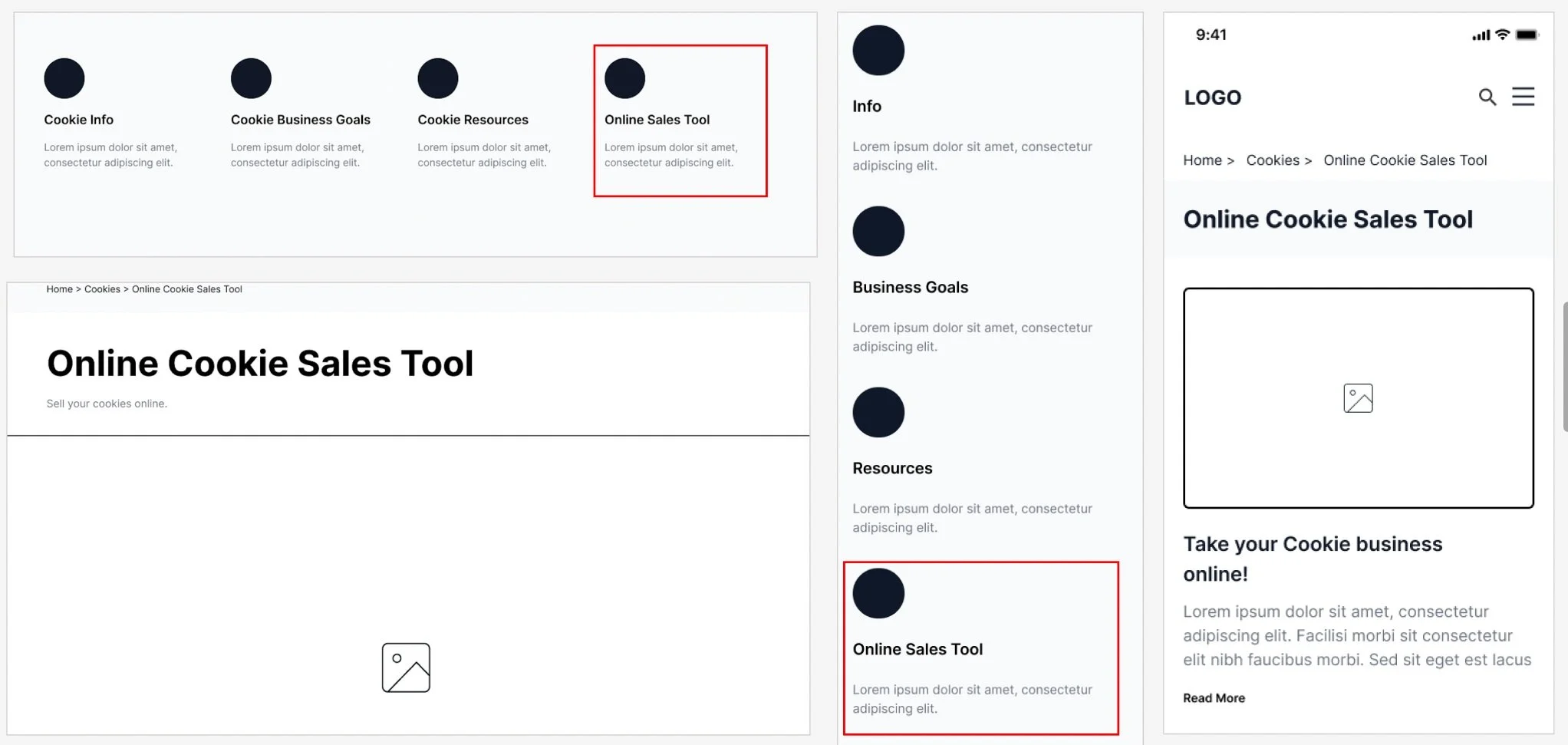
The original website had a cluttered top menu bar filled with redundant options, leading to confusion. We simplified it with a user-friendly navigation bar that included all sub-menu options for easier navigation. To avoid overwhelming users with too many choices, we kept only the top menu options that were unique and important.
3. Added Sub-menus to Landing Pages
Through prototype evaluation, our team discovered that the original label of “Digital Cookie” was ambiguous and uncommunicative. Therefore, our team renamed this to “Online Sales Tool.”
4. Dropdown menus to simplify navigation
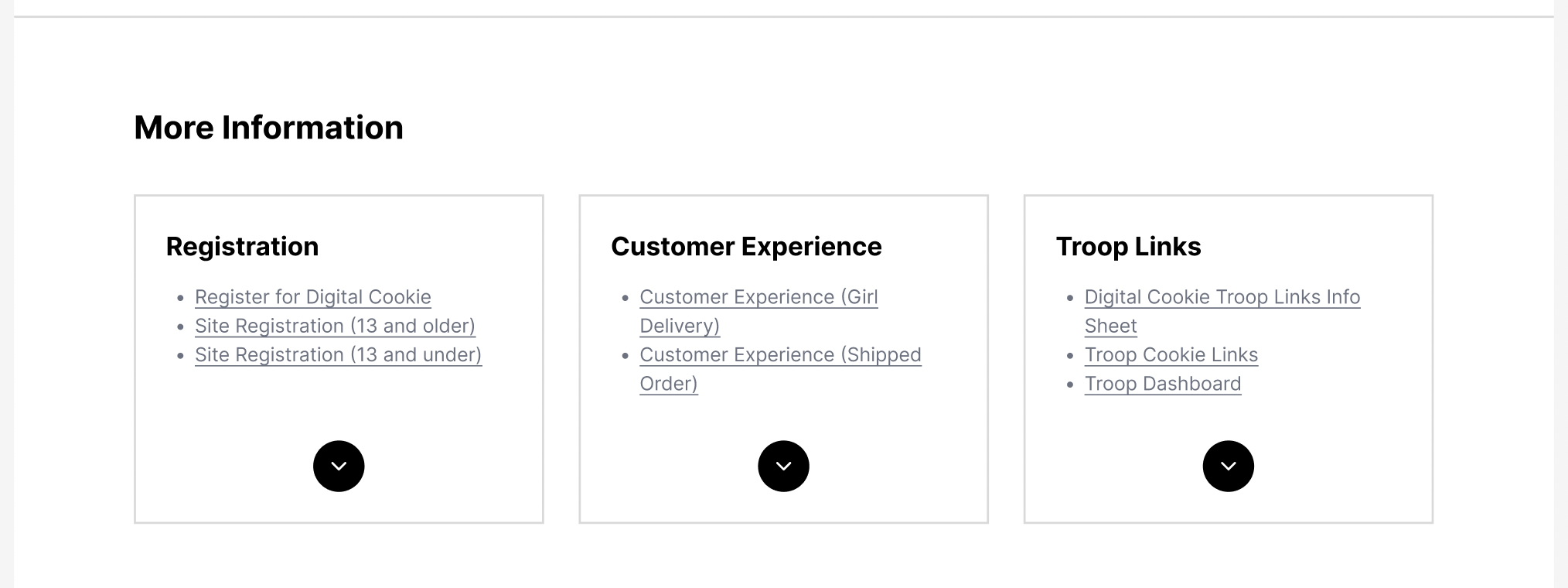
For easy navigation, we provided the sub-menu options on the landing page of each section. Also for the user to immediately recognize where they might need to click at a glance our team decided to use icons.(Inspired from Boys Scouts website)
5. Included Use of Icons for Sub-menu Options
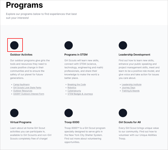
Inspired by Boy Scouts of America's website, we introduced icons to enhance user experience. These icons helped users quickly identify clickable areas within sub-menus, streamlining navigation.
2. Renamed “Digital Cookie” to “Online Sales Tool”
Online cookie sales tool had a lot of links in each of these sub sections. Hence, we planned on adding this drop down option for users to explore more links when needed. This would not overload the users with information.
6. Simplified navigation by adding filters
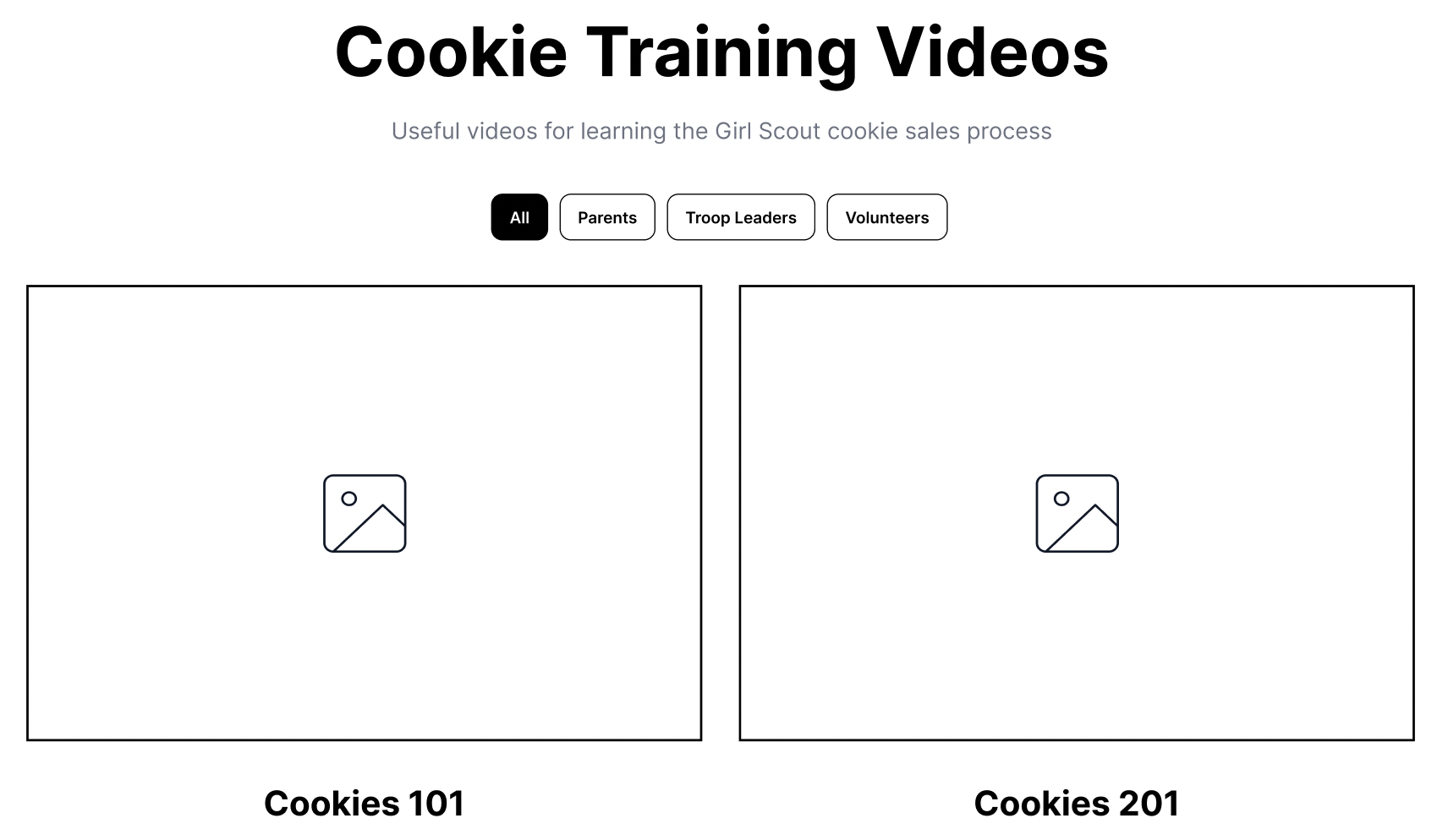
The current GS website has abundant cookie training videos. To simplify finding them on the website, we added user-friendly filters based on individual needs.
We made several design decisions to elevate the experience. For instance, we reorganized the Home Page, simplified the "Volunteer" section into "Get Involved," renamed and reorganized "What Girls Scouts Do in NYC" to "About Us," and moved Awards/Patches to the Top Menu. These changes were based on our research and testing to create a more user-friendly and engaging experience.
A tale of teamwork, learning and user centered approach
We shared our designs and prototypes with other teams, and they were impressed with how well-organized and clean our designs were. They also offered a few suggestions, highlighting the significance of getting feedback for refining designs. This iterative process not only keeps costs in check but also ensures a user-centric approach.
This project was an eye-opener regarding the usefulness of techniques like card sorting and tree testing for content organization. It also showed the value of benchmarking against similar websites, providing insights into best practices. I learned firsthand the pivotal role of user testing in fine-tuning our design and how user feedback can drive substantial improvements.
But this project wasn't just about design. It taught me the importance of teamwork, effective communication, and collaborative problem-solving. I acquired skills in tools like Figma and Miro, leaving me more self-assured and eager to explore what lies ahead.
I'm grateful for the support from my team and professor during this project. While time constraints limited us from conducting more tests and creating high-fidelity wireframes, I believe our solutions address current user issues and enhance their experience. Although there's room for further improvement, this project reflects our commitment to user-centered design.